Archive for category: Website Improvements

SEO Analytics

SEO Analytics: Measuring and Tracking Your SEO Success

To gauge the effectiveness of your search engine optimization (SEO) efforts, SEO is crucial to have a robust analytics strategy in place. SEO analytics helps you measure, track, and analyze various metrics to understand your website’s performance in search engine rankings and organic traffic. This blog post will tell the importance of SEO analytics and provide insights into measuring and tracking your SEO success.

Set Clear Goals and KPIs:

Decide clear goals and key performance indicators (KPIs) for your SEO efforts. Identify metrics that align with your business objectives, such as organic traffic, keyword rankings, conversion rates, or backlink acquisition. These goals and KPIs will serve as benchmarks for measuring your SEO success.

Set Clear Goals and KPIs

Google Analytics:

Integrate Google Analytics with your website to access valuable SEO insights. Monitor organic traffic, user behaviour, conversions, bounce rates, and other relevant metrics. Use Google Analytics to analyze user demographics, traffic sources, and landing page performance to identify strengths and areas for improvement.

Keyword Ranking Reports:

Track your keyword rankings to assess your website’s visibility in search engine results. Utilize SEO tools and software to generate keyword ranking reports regularly. Monitor changes in keyword rankings over time and identify keywords driving significant organic traffic.

Organic Traffic Analysis:

Analyze your website’s organic traffic to understand its growth and performance. Look for trends, patterns, and fluctuations in organic traffic. Segment the data to gain insights into specific landing pages, geographic locations, or devices contributing to organic traffic. Monitor the impact of SEO optimizations on organic traffic growth.

Backlink Analysis:

Track the acquisition and quality of backlinks to your website. Monitor the number of backlinks, referring domains, anchor text diversity, and authority of linking domains. Analyze the impact of backlinks on your website’s visibility and organic traffic. Identify opportunities to acquire high-quality backlinks from reputable sources.

Backlink Analysis

Conversion Tracking:

Implement conversion tracking to measure the effectiveness of your SEO efforts in driving desired actions on your website. Set up goals and e-commerce tracking in Google Analytics to monitor conversions, such as form submissions, purchases, or newsletter sign-ups. Attribute conversions to specific SEO campaigns or landing pages.

User Engagement Metrics:

Assess user engagement metrics to evaluate the quality and relevance of your website’s content. Monitor metrics such as average session duration, pages per session, bounce rate, and exit rate. Analyze user behaviour to identify content that resonates with your audience and optimize underperforming pages.

Site Speed Analysis:

Evaluate your website’s speed using tools like Google PageSpeed Insights or GTmetrix. Analyze page load times, optimize images, leverage browser caching, and minimize server response time. Site speed impacts user experience, bounce rates, and search engine rankings, making it a crucial metric to monitor.

Mobile Performance Analysis:

With mobile devices playing a significant role in online browsing, monitor your website’s mobile performance. Analyze metrics like mobile traffic, mobile bounce rates, and mobile conversions. Ensure that your website is optimized for mobile devices. This will ensure a smooth user experience across smartphones and tablets.

Mobile Performance Analysis

Regular Reporting and Data Analysis:

Generate regular reports and analyze the data to gain insights into your SEO performance. Identify trends, patterns, and correlations between different metrics. Adjust your SEO strategies based on data-driven insights and continuously optimize your website for better results.

SEO analytics is essential for measuring and tracking the success of your SEO efforts. By setting clear goals and KPIs, utilizing tools like Google Analytics, tracking keyword rankings, analyzing organic traffic, assessing backlinks, monitoring conversions, evaluating user engagement metrics, analyzing site speed and mobile performance, and regularly reporting and analyzing data, you can gain valuable insights into your SEO performance and make informed decisions to improve your website’s visibility, organic traffic, and overall SEO success.

Mobile SEO

Mobile SEO: Optimizing Your Website for Mobile Devices

Optimizing your website for mobile users with the increasing use of mobile devices for online browsing is crucial. Mobile SEO focuses on delivering a seamless and user-friendly experience to visitors accessing your website on smartphones and tablets. This blog post will explore effective strategies for optimizing your website for mobile devices and enhancing your mobile SEO performance.

Responsive Web Design:

Implement a responsive web design that automatically adjusts your website’s layout and content based on the user’s device screen size. Responsive design ensures that your website appears and functions optimally across various mobile devices, eliminating the need for separate mobile versions.

Responsive Web Design

Mobile-Friendly Website Speed:

Optimize your website’s speed for mobile devices. Mobile users expect fast-loading websites, and search engines prioritize mobile-friendly websites that provide a great user experience. Compress images, minimize code, enable browser caching, and leverage content delivery networks (CDNs) to enhance your website’s mobile speed performance.

Mobile-Friendly Navigation:

Design intuitive and user-friendly navigation for mobile devices. Ensure menus, buttons, and links are easily clickable and accessible on smaller screens. Implement a logical hierarchy and consider using collapsible menus or icons for a streamlined mobile navigation experience.

Readability and Font Sizes:

Optimize the readability of your website on mobile devices. Use legible fonts and appropriate font sizes that are easily readable without zooming. Avoid using small text or excessive line spacing that may strain the user’s eyes or require unnecessary scrolling.

Optimized Images and Media:

Optimize images and media for mobile devices to reduce load times and improve user experience. Compress images without compromising quality, use appropriate image formats, and implement lazy loading to load media content as the user scrolls. Additionally, ensure that videos are mobile-friendly and compatible with popular mobile devices.

Optimize Images and Media

Mobile-Friendly Forms and CTAs:

Ensure that forms, contact fields, and call-to-action (CTA) buttons are optimized for mobile devices. Simplify form fields, use auto-fill options, and make CTAs prominent and easily clickable. Minimize the number of form fields to reduce user input and make the conversion process more convenient.

Mobile Search Optimization:

Optimize your website’s content and meta tags for mobile searches. Conduct keyword research specific to mobile users and incorporate mobile-focused keywords naturally into your content. Create concise and compelling meta descriptions that display fully in mobile search results, enticing users to click on your website.

Local Mobile SEO:

Optimize your website for local mobile searches if your business targets local customers. Include your business’s location and contact information prominently on your mobile site. Leverage local keywords, optimize your Google My Business listing, and encourage user reviews and ratings to enhance local mobile visibility.

Test and Monitor Mobile Performance:

Regularly test your website’s mobile performance using tools like Google’s Mobile-Friendly Test and PageSpeed Insights. Monitor mobile-specific metrics in Google Analytics or other analytics platforms to gain insights into user behavior, conversions, and bounce rates on mobile devices. Make necessary improvements based on data analysis.

Test and Monitor Mobile Performance

User Experience and Mobile-Friendly Content:

Focus on providing a good user experience for mobile visitors. Craft mobile-friendly content that is easy to read, engaging, and formatted for mobile consumption. Break content into smaller sections, use bullet points, and leverage visuals to enhance readability and user engagement.

Mobile SEO is crucial in today’s mobile-driven world. By optimizing your website for mobile devices through responsive web design, mobile-friendly speed, navigation, readability, images, forms, search optimization, local SEO, testing, and user experience, you can ensure that your website gives a seamless and enjoyable experience for mobile users. Investing in mobile SEO will improve your search engine rankings, enhance user satisfaction, and drive more conversions on mobile devices.

Technical SEO

Technical SEO: Optimizing Website’s Structure and Performance

Technical SEO is an important factor of search engine optimization that focuses on improving your website’s structure, performance, and technical elements to enhance its visibility in search engine results. By optimizing your website’s technical factors, you can ensure better crawling and indexing by search engines, leading to improved rankings and user experience. This blog post will explore effective strategies for optimizing your website’s structure and performance through technical SEO.

Optimize Website Speed:

Website speed is critical for both search engine rankings and user experience. Optimize your website’s speed by minimizing code, compressing images, enabling browser caching, and leveraging content delivery networks (CDNs). Regularly test your website’s speed using tools like Google PageSpeed Insights or GTmetrix and make necessary improvements.

Optimize Website Speed

Mobile-Friendly Design:

With the use of mobile devices, having a mobile-friendly website is essential. Ensure your website is responsive and provides a seamless user experience across different screen sizes. Use Google’s Mobile-Friendly Test tool to determine if your website meets mobile-friendly standards and make necessary adjustments.

URL Structure:

Optimize your website’s URL structure to make it user-friendly and search engine-friendly. Use descriptive keywords in your URLs instead of generic or random strings of numbers and characters. Apply a logical hierarchy with relevant keywords to improve crawlability and understandability.

Implement Structured Data Markup:

Implement structured data markup, such as Schema.org markup, to provide additional context and meaning to search engines about your website’s content. This can enhance search engine understanding and result in rich snippets or enhanced search results for your web pages.

XML Sitemap:

Create an XML sitemap for your website to help search engines crawl and index web pages more efficiently. Include all relevant pages in the sitemap, such as blog posts, product pages, or landing pages. Submit the XML sitemap to search engines like Google and Bing using their respective webmaster tools.

XML Sitemap

Canonicalization:

Use canonical tags to address duplicate content issues. Canonical tags identify the preferred version of a web page when multiple versions with similar content exist. This helps search engines understand which version to index and rank, avoiding duplicate content penalties.

HTTPS and SSL:

Secure your website with HTTPS (Hypertext Transfer Protocol Secure) and an SSL (Secure Sockets Layer) certificate. HTTPS encrypts data transmitted between a user’s browser and your website, ensuring secure communication. Search engines prioritize secure websites, which can positively impact search rankings.

Optimize Robots.txt File:

Optimize your website’s robots.txt file to guide search engine crawlers and prevent irrelevant or sensitive content indexing. Use the robots.txt file to disallow specific directories or files you do not want to be crawled or indexed.

Fix Broken Links and 404 Errors:

Frequently audit your website for broken links and 404 errors. Broken links and 404 errors negatively impact user experience and can harm your search engine rankings. Use tools like Google Search Console or online crawlers to identify and fix broken links promptly.

Fix Broken Links and 404 Errors

Monitor and Analyze Technical Issues:

Regularly monitor your website for technical issues using tools like Google Search Console, Bing Webmaster Tools, or third-party SEO auditing tools. Analyze reports and address crawl errors, duplicate content, server errors, or HTML markup errors to ensure optimal technical performance.

Technical SEO is crucial in optimizing your website’s structure and performance, improving search engine rankings and user experience. By optimizing website speed, ensuring mobile-friendliness, creating XML sitemaps, optimizing URL structure, implementing structured data markup, addressing canonicalization, securing with HTTPS and SSL, optimizing robots.txt files, fixing broken links and 404 errors, and monitoring technical issues, you can lay a strong foundation for your website’s success in search engines.

Tips for Choosing a Theme with Easy Customization Options

Tips for Choosing a Theme with Easy Customization Options

Selecting the right WordPress theme is crucial for building a website that shows your brand and meets your specific needs. Choosing a theme with easy customization options empowers you to personalize the design, modify functionality, and create a unique online presence. This blog post will provide valuable tips for selecting a theme that offers seamless customization options, ensuring a smooth and efficient website-building process.

Prioritize Customization Options:

When browsing for themes, prioritize those that explicitly highlight their customization options. Look for themes that advertise easy-to-use customization panels, intuitive theme options, or compatibility with popular page builders and customization plugins. Themes that emphasize customization are more likely to provide the flexibility you need.

Prioritize Customization Options

Theme Customization Panel:

A well-designed theme customization panel simplifies modifying key elements of your website. Look for themes that offer an intuitive and user-friendly customization panel, allowing you to customize colours, typography, layouts, and other essential elements. The customization panel should provide real-time previews and various options to suit your design preferences.

Page Builders Compatibility:

Consider themes compatible with popular page builders like Elementor, Divi, or Beaver Builder. Page builders provide a drag-and-drop interface, enabling you to easily create custom layouts and modify content. Compatibility with page builders ensures seamless integration and extends the customization possibilities of your chosen theme.

Customization Plugin Support:

Ensure that the theme supports popular customization plugins, such as Customizer or Visual Composer. Customization plugins offer additional options for modifying various aspects of your website, such as headers, footers, sidebars, and more. The theme’s compatibility with such plugins expands your customization capabilities.

Flexible Layout Options:

Choose a theme that offers a variety of flexible layout options. Look for themes that provide multiple pre-designed layouts or the ability to create custom layouts. Flexible layout options allow you to arrange your content uniquely and adapt the design to your requirements.

Flexible Layout Options

Colour and Typography Customization:

Customizing colours and typography is crucial for maintaining a consistent brand identity. Ensure that the theme allows easy customization of colours, including primary and secondary colours, backgrounds, links, and buttons. Additionally, the theme should provide options to modify font styles, sizes, and weights to achieve the desired typographic look.

Widget and Widget Area Customization:

Widgets offer dynamic content and functionality on your website. Ensure that the theme allows easy customization of widgets and widget areas. Look for themes that provide options for arranging widgets, changing their appearance, or customizing widget areas to fit your content requirements.

Header and Footer Customization:

Headers and footers are key elements of your website’s design. Choose a theme that allows easy customization of header and footer styles. Look for options to modify logo placement, navigation menus, social media icons, copyright text, and other elements within the header and footer areas.

Responsive Design:

In today’s mobile-driven world, responsive design is essential. Ensure your theme is fully responsive and provides a consistent user experience across various devices and screen sizes. Responsive design ensures that your customizations look great on desktops, tablets, and mobile devices.

Responsive Web Design

Read Reviews and Ratings:

Before finalizing your choice, read reviews and ratings of the theme you are considering. Pay attention to feedback regarding customization options, ease of use, and customer support. Reviews provide insights into the user experience and help you make an informed decision.

Choosing a WordPress theme with easy customization options is vital in creating a website that truly reflects your brand and meets your unique requirements. Prioritize themes that offer intuitive customization panels, compatibility with popular page builders and customization plugins, flexible layout options, colour and typography customization, widget and widget area customization, header and footer customization, responsive design, and positive reviews. By following these tips, you can select a theme that simplifies the customization process and empowers you to create a standout online presence.

Adding Custom Functionality to Your WordPress Theme

Adding Custom Functionality to Your WordPress Theme

WordPress themes provide a solid foundation for your website’s design and layout. However, you may need to add custom functionality to your theme to meet specific requirements or enhance the user experience. This article will teach us various methods for adding custom functionality to your WordPress theme, empowering you to extend and tailor its capabilities to your needs.

Child Themes:

Utilize child themes to add custom functionality while maintaining the integrity of the parent theme. Child themes allow you to override and extend the performance of the parent theme without modifying its core files. This ensures that your customizations remain intact when the parent theme is updated.

Child Theme

Custom Functions.php:

Leverage the power of the functions.php file to add custom functionality to your theme. This file acts as a “plugin” within your theme, allowing you to define custom functions, hooks, and filters. You can use these functions to modify or extend the functionality of your theme.

Custom Templates:

Create custom templates to add unique functionality to specific pages or sections of your website. Custom templates enable you to design layouts and styles for pages beyond the default templates the theme provides. This flexibility allows you to tailor the functionality to suit your specific needs.

Custom Post Types and Taxonomies:

Utilize custom post types and taxonomies to add custom content types and categories to your website. Custom post types allow you to create content structures specific to your needs, such as portfolios, events, products, or testimonials.

Custom Shortcodes:

Implement custom shortcodes to add specific functionality or display dynamic content within your posts and pages. Shortcodes are placeholders that trigger predefined actions or display specific content when inserted into your content editor. Custom shortcodes simplify the process of adding complex functionality without extensive coding.

Custom Shortcodes

Custom Widgets:

Create custom widgets to add functionality and content to your theme’s widget areas. Custom widgets can enhance the user experience and provide additional functionality to your theme’s sidebar or footer.

Custom Theme Options:

Implement custom theme options panels to allow users to customize certain aspects of your theme without touching the code. Theme options panels provide an intuitive interface for users to modify theme settings, such as colours, fonts, layout options, or custom text fields. Custom theme options enhance user flexibility and make your theme more versatile.

Plugin Integration:

Extend your theme’s functionality by integrating with existing or creating custom plugins. Plugins can add advanced features like e-commerce functionality, membership systems, advanced search capabilities, or integration with third-party services. Leveraging plugins allow you to add complex functionality to your theme without reinventing the wheel.

Collaboration with Developers:

Collaborate with experienced developers to add custom functionality to your theme. Developers can help you implement complex features, optimize performance, and ensure compatibility with other WordPress plugins or services. Working with developers expands your options and allows you to bring your unique ideas to life.

Collaboration with Developers


Custom Navigation Menus:

Enhance your theme’s navigation by adding custom navigation menus. Custom menus give you full control over the structure and content of your website’s navigation. You can create multiple menus, include custom links, and define menu locations to provide a seamless and intuitive navigation experience.

Adding custom functionality to your WordPress theme enables you to tailor it to your needs and create a unique user experience. Whether through child themes, custom functions.php, custom templates, custom post types, custom shortcodes, custom widgets, custom theme options, plugin integration, custom navigation menus, or collaboration with developers, you can extend your theme’s capabilities and unlock its full potential.

Troubleshooting Common Issues in Theme Customization

Troubleshooting Common Issues in Theme Customization

Theme customization allows you to personalize your WordPress website and make it unique. However, customization can sometimes come with challenges and issues that must be resolved. In this blog post, we will explore some common issues that arise during theme customization and provide troubleshooting tips to help you overcome them. By understanding these challenges and knowing how to tackle them, you can ensure a smooth and successful theme customization process.

White Screen of Death (WSOD):

Encountering a white screen after making customization changes can be frustrating. This usually occurs due to PHP errors in your code. To troubleshoot this issue:

  1. Access your website’s error logs or enable WordPress debugging mode to identify the specific error.
  2. Check for syntax errors, missing parentheses, or conflicting code.
  3. Fix the error and refresh your website to see if the issue is resolved.

Missing or Disappearing Content:

In some cases, content may appear to be missing or disappear after customization changes. This can occur if you inadvertently modify or remove essential template tags or functions. Double-check your customizations and ensure that you have retained critical code. Restoring the missing code or reverting to a previous version can help resolve this issue.

Missing or Disappearing Content

Broken Layouts or Misaligned Elements:

Customization changes can sometimes lead to broken layouts or misaligned elements on your website. This can be caused by incorrect HTML structure, conflicting CSS styles, or missing closing tags. Use browser developer tools to inspect the affected elements and identify any HTML or CSS issues. Make necessary adjustments to ensure proper alignment and a consistent layout.

Inconsistent Styling:

Sometimes, after customizing the theme’s styles or adding custom CSS, you may notice inconsistencies in the styling of certain elements. This can occur due to specificity conflicts or CSS overrides. Use browser developer tools to inspect the affected elements and identify the conflicting styles. Adjust your CSS selectors or use more specific selectors to ensure the desired styling is applied consistently.

Plugin Compatibility Issues:

Customization changes may sometimes conflict with certain plugins, resulting in compatibility issues. If you experience unexpected behaviour or functionality after customizing your theme, temporarily deactivate your plugins individually to identify the conflicting plugin. Once identified, check for updates or seek support from the plugin developer to resolve the compatibility issue.

Slow Website Performance:

Intensive customizations or improperly optimized code can impact your website’s performance and lead to slow loading times. To troubleshoot this issue, use performance testing tools to identify performance bottlenecks, such as large image files, excessive server requests, or inefficient code. Optimize your images, minimize HTTP requests, and optimize your code to improve website performance.

Slow Website Performance

Customization Loss after Theme or Plugin Updates:

Updating your theme or plugins can sometimes overwrite your customization changes. To prevent customization loss, use a child theme or custom CSS plugin to store your customizations separately. This way, your changes will remain intact after theme or plugin updates.

Cross-Browser Compatibility Issues:

Customization changes may not always render correctly across different web browsers. Test your website in various browsers, including Chrome, Firefox, Safari, and Internet Explorer, to identify compatibility issues. Use browser-specific CSS fixes or polyfills to address the discrepancies and ensure consistent rendering.

Insufficient Documentation or Support:

Lack of sufficient documentation or support for your theme can pose challenges when troubleshooting customization issues. Before choosing a theme, research its documentation and user reviews to assess the quality and availability of support. Contact the theme developer or community forums for assistance and guidance when facing customization issues.

Regular Backups:

To safeguard your customization work, regularly back up your website. Backing up your website ensures you can restore previous versions in case of critical errors or issues during the customization process.

Regular Backups

Theme customization is a powerful tool for creating a unique website but it can come with challenges. By understanding and troubleshooting common issues such as the white screen of death, inconsistent styling, broken layouts, plugin compatibility issues, missing content, slow website performance, customization loss, cross-browser compatibility issues, insufficient documentation or support, and regular backups, you can overcome these obstacles and enjoy a successful theme customization experience.

Incorporating Custom Widgets into Your WordPress Theme

Incorporating Custom Widgets into Your WordPress Theme

Widgets are a powerful feature in WordPress that allows you to add dynamic content and functionality to your website’s sidebar, footer, or other widgetized areas. By incorporating custom widgets into your WordPress theme, you can enhance the user experience, provide valuable information, and tailor your website to meet specific needs. In this blog post, we will explore the benefits of custom widgets and provide guidance on effectively integrating them into your WordPress theme.

Understanding Widgets:

Widgets are self-contained modules that can be easily dragged and dropped into widgetized areas of your theme. They provide dynamic content and functionality, such as displaying recent posts, social media feeds, search bars, or custom content. WordPress has several built-in widgets, but custom widgets offer greater flexibility and customization options.

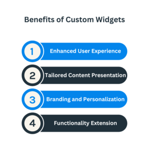
Benefits of Custom Widgets:

Incorporating custom widgets into your WordPress theme offers several benefits:

Enhanced User Experience: Custom widgets provide valuable information and interactive elements that improve the overall user experience on your website.

Tailored Content Presentation: Custom widgets allow you to present specific content, such as testimonials, portfolios, or product showcases, in a visually appealing and organized manner.

Branding and Personalization: Custom widgets help you showcase your brand identity by displaying custom logos, taglines, or social media feeds.

Functionality Extension: Custom widgets can integrate with third-party services, provide advanced search options, or offer unique functionalities that enhance your website’s capabilities.

Benefits of Custom Widgets

Identifying Widget Areas:

Before incorporating custom widgets, identify the widget areas available in your WordPress theme. Common widget areas include the theme’s sidebar, footer, header, or specific sections. Understanding the available widget areas will help you effectively plan and design your custom widgets.

Creating Custom Widgets:

You can leverage plugins, write your own code, or work with a developer to create custom widgets. WordPress provides a Widget API that simplifies the process of creating custom widgets. Use PHP, HTML, CSS, and JavaScript to define the widget’s appearance and functionality.

Adding Widget Settings:

Enhance the functionality of your custom widgets by adding customizable settings. For example, creating a custom testimonial widget allows users to add testimonials, customize the number of testimonials displayed, or choose the display style. Utilize the WordPress Widget API to define and manage these settings.

Customizing Widget Design:

Customize the design of your custom widgets to match your theme’s aesthetics. Use CSS to style the widget’s container, fonts, colours, and spacing. Ensure that the widget design is consistent with the overall design of your website.

Customizing Widget Design

Widgetizing Specific Sections:

Extend the widget functionality by digitizing specific sections of your theme. For example, suppose you have a custom homepage layout. In that case, you can create widgetized areas within that layout to give users greater control over the content displayed.

Leveraging Third-Party Widget Plugins:

Explore third-party widget plugins that offer advanced functionalities and features. These plugins can extend the capabilities of your custom widgets by integrating with external services, providing complex layouts, or adding interactive elements. Assess the compatibility and performance of the plugins before incorporating them into your theme.

Testing and Compatibility:

Regularly test your custom widgets across different browsers, devices, and screen sizes to ensure proper functionality and responsiveness. Verify compatibility with the newest version of WordPress and any other plugins or themes used in conjunction with your custom widgets.

Documentation and Support:

Document your custom widgets to provide instructions on their usage and configuration. Offer support to users with questions or issues when using your custom widgets. Providing clear documentation and support enhances the user experience and builds a positive reputation for your theme.

Documentation and Support

Incorporating custom widgets into your WordPress theme empowers you to enhance the user experience, tailor content presentation, extend functionality, and showcase your brand identity. By understanding widget areas, creating custom widgets, customizing their design, adding widget settings, digitizing specific sections, leveraging third-party widget plugins, testing for compatibility, and providing documentation and support, you can successfully incorporate custom widgets into your WordPress theme and take your website to the next level.

Creating a Unique Website Design with Theme Customization

Creating a Unique Website Design with Theme Customization

When designing a website, standing out from the crowd is essential. WordPress theme customization provides a powerful toolkit for creating a unique and visually stunning website that reflects your brand identity. This blog post will explore various techniques and strategies for leveraging theme customization to create a truly unique website design.

Choose the Right Theme:

Choose a WordPress theme that suits your design vision and provides the flexibility to customize key elements. Look for themes that offer robust customization options, multiple layout variations, and support for custom post types and page templates.

Choose the Right Theme

Customize Colors and Typography:

Use theme customization settings or custom CSS to modify the colours and typography of your website. Choose a colour palette that aligns with your brand identity and select fonts that convey the desired tone. Consistent and visually appealing colours and typography create a unique and cohesive design.

Personalize the Header and Footer:

Customize your website’s header and footer sections to make a memorable first impression and enhance navigation. Add your logo, tagline, and contact information to the header. Tailor the footer with widgets, social media links, or copyright information. These personalized touches create a unique brand experience.

Custom Post Types and Taxonomies:

Extend the functionality of your website by creating custom post types and taxonomies. This allows you to showcase different types of content, such as case studies, events, or products, in unique ways. Organize your content using custom taxonomies, offering visitors intuitive navigation and a tailored browsing experience.

Custom Page Templates:

Take advantage of custom page templates to design unique layouts for specific pages. Create templates for landing pages, portfolio showcases, team member profiles, or testimonials. Custom page templates allow you to experiment with different layouts and optimize each page’s design for its specific purpose.

Custom Page Templates

Implement Custom Widgets:

Enhance your theme customization by adding custom widgets to your sidebars or widgetized areas. Custom widgets can display featured content, testimonials, or social media feeds. They provide dynamic elements that engage visitors and add a personalized touch to your website.

Integrate Custom Fonts:

Stand out from the crowd by integrating custom fonts into your theme. Choose unique fonts that complement your brand and enhance the overall design. Utilize web font services like Google Fonts or Adobe Fonts to access a wide range of font options and ensure consistent rendering across different devices.

Customize the Navigation Menu:

Create a distinctive navigation menu by customizing its appearance and functionality. Modify colours, add hover effects, or create unique menu layouts. Consider implementing a sticky or mega menu for improved navigation and user experience.

Design Unique Blog Layouts:

Customize your blog layout to showcase your content uniquely and visually appealingly. Experiment with different post formats, grid layouts, or featured images. Use theme customization options or custom page builders to create eye-catching blog designs that resonate with your target audience.

Guest Blogging

Responsive Design and Mobile Optimization:

Ensure your theme customization is responsive and optimized for mobile devices. Check your website on different screen sizes and devices to ensure a seamless user experience. Responsive design guarantees that your unique design remains visually appealing and functional across all devices.

WordPress theme customization empowers you to create a unique website design that reflects your brand identity and captivates your audience. By choosing the right theme, customizing colours and typography, personalizing the header and footer, utilizing custom page templates, implementing custom post types and taxonomies, integrating custom fonts, adding custom widgets, customizing the navigation menu, designing unique blog layouts, prioritizing responsive design and mobile optimization, you can release your creativity and bring your unique website design vision to life.

Understanding Child Themes Benefits and Implementation

Understanding Child Themes: Benefits and Implementation

WordPress child themes are powerful tools that allow you to customize and extend the performance of your parent theme without modifying its core files. Child themes provide numerous benefits, including more accessible updates, improved maintainability, and the ability to preserve your customizations. In this blog post, we will explore the benefits of using child themes and provide a step-by-step guide to implementing them effectively.

Benefits of Child Themes:

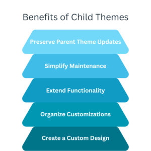
Preserve Parent Theme Updates:

One of the primary benefits of using child themes is that it allows you to update the parent theme without losing your changes. By keeping your customizations separate in the child theme, you can take advantage of new features, security patches, and bug fixes released by the parent theme developers.

Simplify Maintenance:

Child themes make maintenance easier by isolating your customizations from the parent theme. When you need to modify or update your customizations, you can focus solely on the child theme rather than dealing with the complexities of the entire parent theme. This streamlined approach improves efficiency and reduces the risk of unintended changes.

Extend Functionality:

Child themes provide a platform to add new functionalities to your WordPress website. You can leverage hooks, filters, and actions to modify or extend the behavior of the parent theme. This flexibility allows you to customize and enhance your website according to your requirements.

Organize Customizations:

Using a child theme, you can organize your customizations in a structured and manageable manner. Separate files and directories in the child theme allow for a clear distinction between the original parent theme files and your custom code, making locating and modifying specific elements easier.

Create a Custom Design:

Child themes enable you to create a completely custom design while still leveraging the core features and functionality of the parent theme. You can override specific CSS styles, templates, and layout elements to achieve a unique visual appearance that aligns with your brand identity.

Benefits of Child Themes

Implementing a Child Theme:

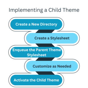
Create a New Directory:

Create a new directory in your WordPress installation’s “wp-content/themes/” folder. Name the directory appropriately, indicating that it is a child theme of the parent theme you are using.

Create a Stylesheet:

Create a stylesheet file in the child theme directory named “style.css”. Add a CSS comment at the top of the file and specify the “Template” field. Indicating the parent theme’s directory name.

Enqueue the Parent Theme Stylesheet:

In the child theme’s functions.php file, enqueue the parent theme’s stylesheet using the “wp_enqueue_style” function. This ensures that the parent theme’s styles are loaded before the child theme’s styles.

Customize as Needed:

Add any additional CSS styles, template files, or functionality to the child theme’s directory as required. Modify template files from the parent theme by copying them to the child theme and making the necessary modifications.

Activate the Child Theme:

In the WordPress dashboard, navigate to “Appearance” > “Themes” and activate the child theme. Please verify that your customizations are applied correctly, and your website maintains its desired appearance and functionality.

Implementing a Child Theme

Using child themes in WordPress offers a range of benefits, including the ability to preserve parent theme updates, simplify maintenance, extend functionality, organize customizations, and create custom designs. If you follow the instructions in this article, you can quickly implement a WordPress theme child and customize it confidently.

Optimizing Website Speed Tips for a Faster WordPress Site

Optimizing Website Speed: Tips for a Faster WordPress Site

In today’s fast-paced online world, website speed is crucial in user experience, search engine rankings, and overall website success. If your WordPress site takes too long to open, visitors may abandon it, leading to lost opportunities and decreased conversions. In this blog post, we will explore practical tips and techniques to optimize the speed of your WordPress site, ensuring a faster and more responsive user experience.
Choose a Fast Web Hosting Provider:

Selecting a high-quality web hosting provider is the foundation for a fast-loading WordPress site. Opt for a hosting provider specializing in WordPress hosting, which offers solid-state drives (SSDs) for faster data retrieval and provides scalable resources to handle traffic spikes. Ensure that the hosting infrastructure is optimized for website speed and reliability.

Fast Web Hosting

Use a Lightweight and Well-Optimized Theme:

The choice of theme significantly impacts your site’s speed. Opt for lightweight pieces that are designed for performance. Avoid bloated themes with excessive features and complex designs that slow down your site. Look for articles optimized for speed and follow best practices for efficient coding.

Minimize Plugin Usage:

While plugins add functionality to your WordPress site, using too many plugins can impact performance. Assess your installed plugins and deactivate or uninstall any unnecessary ones. Choose lightweight alternatives or seek integrated solutions where a single plugin performs multiple functions. Regularly update your plugins to ensure compatibility and optimized performance.

Enable Caching:

Caching reduces the need for repeated database queries and server processing, resulting in faster page loads. Utilize caching plugins like WP Rocket, W3 Total Cache, or WP Super Cache to generate static HTML files of your pages. These plugins save and serve the files to visitors, reducing server load and improving response times.

Optimize Images:

Images are often the most significant contributors to slow page loading times. Optimize your images before uploading them to your WordPress site. Use image compression plugins like Smush or EWWW Image Optimizer to reduce file sizes without compromising quality. Also, utilize the srcset attribute to serve appropriately sized images based on the visitor’s device.

Optimize Images

Minify CSS and JavaScript Files:

Minifying CSS and JavaScript files reduce the size by removing unnecessary spaces, line breaks, and comments. Use plugins like Autoptimize or W3 Total Cache to minify and combine CSS and JavaScript files. This minimizes the number of requests made to the server, resulting in faster page rendering.

Implement Lazy Loading:

Slow loading is a technique that defers the loading of non-visible images and videos until the user scrolls through them. This improves initial page load times by reducing the content loaded upfront. Use plugins like Lazy Load by WP Rocket or a lightweight JavaScript library like lazy Sizes to implement lazy loading on your WordPress site.

Optimize Database:

Regularly optimize your WordPress database to keep it clean and efficient. Use plugins like WP-Optimize or WP Sweep to remove unnecessary data, optimize database tables, and improve overall performance. Regular database optimization ensures faster data retrieval and smoother site operation.

Enable GZIP Compression:

GZIP compression decreases the size of files sent from the server to the visitor’s browser, resulting in faster page loads. Enable GZIP compression by adding the code down below to your website’s .htaccess file:

<IfModule mod_deflate.c>

  AddOutputFilterByType DEFLATE text/plain

  AddOutputFilterByType DEFLATE text/html

  AddOutputFilterByType DEFLATE text/CSS

  AddOutputFilterByType DEFLATE text/javascript

  AddOutputFilterByType DEFLATE application/javascript

  AddOutputFilterByType DEFLATE application/x-javascript

  Add

OutputFilterByType DEFLATE application/xml

  AddOutputFilterByType DEFLATE application/xhtml+xml

  AddOutputFilterByType DEFLATE application/rss+xml

  AddOutputFilterByType DEFLATE application/atom_xml

  AddOutputFilterByType DEFLATE application/x-font

  AddOutputFilterByType DEFLATE application/x-font-TrueType

  AddOutputFilterByType DEFLATE application/x-font-ttf

  AddOutputFilterByType DEFLATE application/x-font-of

  AddOutputFilterByType DEFLATE application/x-font-opentype

  AddOutputFilterByType DEFLATE application/vnd.ms-font object

  AddOutputFilterByType DEFLATE font/ttf

  AddOutputFilterByType DEFLATE font/otf

  AddOutputFilterByType DEFLATE font/opentype

</IfModule>

GZIP Compression

Regularly Monitor and Optimize:

Website optimization is an ongoing process. Regularly monitor your site’s speed using tools like Google PageSpeed Insights or GTmetrix. Identify areas for improvement, perform tests after making changes, and fine-tune your optimizations for better speed and performance.

By implementing these optimization techniques, you can significantly improve the website speed and responsiveness of your WordPress site. Choose a reliable hosting provider, use lightweight themes and plugins, enable caching, optimize images, minify files, implement lazy loading, optimize the database, enable GZIP compression, and regularly monitor and optimize your site. A faster WordPress site enhances user experience, boosts your search engine rankings, and helps achieve your website goals more efficiently.