Archive for category: Website Designs & Layouts

The Benefits of Using a Page Builders for WordPress Websites

The Benefits of Using a Page Builders for WordPress Websites

Building and designing a website can be complex and time-consuming, especially if you need to gain extensive coding knowledge. However, with the advent of page builders for WordPress, creating stunning and professional websites has become accessible to everyone. In this blog post, we will explore the benefits of using a page builders for WordPress websites and how it can revolutionize your web development experience.

No Coding Skills Required:

One of the most significant advantages of using a page builder is that you don’t need coding skills to create a visually appealing website. Page builders offer a drag-and-drop interface, allowing you to design and customize your website by simply dragging elements onto the page and arranging them as desired. This empowers individuals without technical expertise to build professional websites with ease.

Intuitive and User-Friendly Interface:

Page builders provide an intuitive, user-friendly interface that simplifies website design. You can add text boxes, images, buttons, sliders, videos and other elements and easily customize their layout, appearance and functionality. The real-time preview feature allows you to see the changes instantly, enabling you to fine-tune your design until it meets your vision.

Faster Website Development:

Using a page builder significantly speeds up the website development process. With pre-designed templates, blocks, and sections available, you can quickly create the structure of your website without starting from scratch. These pre-designed elements can be customized to match your brand identity, saving valuable time in designing and coding.

Flexibility and Customizability:

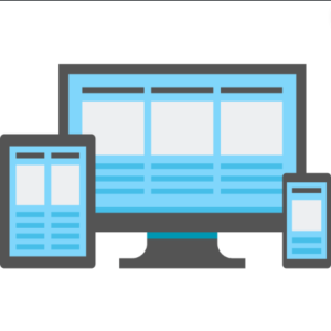
Page builders offer immense flexibility, allowing you to create unique and custom designs for your website. The website allows you to customize everything from fonts, colors, layout, and spacing. Advanced features like responsive design options ensure your website looks great on all devices, eliminating the need for separate mobile versions.

No Dependency on Themes:

Page builders free you from the constraints of pre-built themes. While themes provide a foundation, a page builder lets you override and customize their design to achieve your desired look and feel. You can design a completely custom website without being constrained by the restrictions of a specific theme. This level of creative freedom is invaluable for businesses and individuals looking for a unique online presence.

Seamless Content Editing:

One of the frustrations of traditional website development is the need to go back and forth between the front-end and back-end interfaces. With a page builder, you can edit and update your website’s content directly on the front end, seeing the changes in real-time. This streamlines content creation and editing, making it more efficient and convenient.

Cost-Effective Solution:

Using a website builder can save money on hiring a professional designer or web developer. You can create and maintain your website with a page builder without ongoing technical assistance. The money saved can be invested in other aspects of your business or website, such as marketing or content creation.

Regular Updates and Support:

Functional development teams typically support page builder plugins so that you can expect regular updates and new features. This ensures your website remains compatible with the latest WordPress version and security standards. Furthermore, most page builders have dedicated support teams or communities where you can seek assistance or find answers to your questions.


Page builders have revolutionized website development, empowering individuals and businesses to create stunning and customized websites without coding knowledge. From their user-friendly interface and flexibility to their cost-effectiveness and regular updates. Page builders provide many benefits for WordPress website owners. Embrace the power of a page builder, and unleash your creativity to build visually appealing and functional websites that leave a lasting impression on your visitors.

Tips for Choosing a Theme with Easy Customization Options

Tips for Choosing a Theme with Easy Customization Options

Selecting the right WordPress theme is crucial for building a website that shows your brand and meets your specific needs. Choosing a theme with easy customization options empowers you to personalize the design, modify functionality, and create a unique online presence. This blog post will provide valuable tips for selecting a theme that offers seamless customization options, ensuring a smooth and efficient website-building process.

Prioritize Customization Options:

When browsing for themes, prioritize those that explicitly highlight their customization options. Look for themes that advertise easy-to-use customization panels, intuitive theme options, or compatibility with popular page builders and customization plugins. Themes that emphasize customization are more likely to provide the flexibility you need.

Prioritize Customization Options

Theme Customization Panel:

A well-designed theme customization panel simplifies modifying key elements of your website. Look for themes that offer an intuitive and user-friendly customization panel, allowing you to customize colours, typography, layouts, and other essential elements. The customization panel should provide real-time previews and various options to suit your design preferences.

Page Builders Compatibility:

Consider themes compatible with popular page builders like Elementor, Divi, or Beaver Builder. Page builders provide a drag-and-drop interface, enabling you to easily create custom layouts and modify content. Compatibility with page builders ensures seamless integration and extends the customization possibilities of your chosen theme.

Customization Plugin Support:

Ensure that the theme supports popular customization plugins, such as Customizer or Visual Composer. Customization plugins offer additional options for modifying various aspects of your website, such as headers, footers, sidebars, and more. The theme’s compatibility with such plugins expands your customization capabilities.

Flexible Layout Options:

Choose a theme that offers a variety of flexible layout options. Look for themes that provide multiple pre-designed layouts or the ability to create custom layouts. Flexible layout options allow you to arrange your content uniquely and adapt the design to your requirements.

Flexible Layout Options

Colour and Typography Customization:

Customizing colours and typography is crucial for maintaining a consistent brand identity. Ensure that the theme allows easy customization of colours, including primary and secondary colours, backgrounds, links, and buttons. Additionally, the theme should provide options to modify font styles, sizes, and weights to achieve the desired typographic look.

Widget and Widget Area Customization:

Widgets offer dynamic content and functionality on your website. Ensure that the theme allows easy customization of widgets and widget areas. Look for themes that provide options for arranging widgets, changing their appearance, or customizing widget areas to fit your content requirements.

Header and Footer Customization:

Headers and footers are key elements of your website’s design. Choose a theme that allows easy customization of header and footer styles. Look for options to modify logo placement, navigation menus, social media icons, copyright text, and other elements within the header and footer areas.

Responsive Design:

In today’s mobile-driven world, responsive design is essential. Ensure your theme is fully responsive and provides a consistent user experience across various devices and screen sizes. Responsive design ensures that your customizations look great on desktops, tablets, and mobile devices.

Responsive Web Design

Read Reviews and Ratings:

Before finalizing your choice, read reviews and ratings of the theme you are considering. Pay attention to feedback regarding customization options, ease of use, and customer support. Reviews provide insights into the user experience and help you make an informed decision.

Choosing a WordPress theme with easy customization options is vital in creating a website that truly reflects your brand and meets your unique requirements. Prioritize themes that offer intuitive customization panels, compatibility with popular page builders and customization plugins, flexible layout options, colour and typography customization, widget and widget area customization, header and footer customization, responsive design, and positive reviews. By following these tips, you can select a theme that simplifies the customization process and empowers you to create a standout online presence.

Adding Custom Functionality to Your WordPress Theme

Adding Custom Functionality to Your WordPress Theme

WordPress themes provide a solid foundation for your website’s design and layout. However, you may need to add custom functionality to your theme to meet specific requirements or enhance the user experience. This article will teach us various methods for adding custom functionality to your WordPress theme, empowering you to extend and tailor its capabilities to your needs.

Child Themes:

Utilize child themes to add custom functionality while maintaining the integrity of the parent theme. Child themes allow you to override and extend the performance of the parent theme without modifying its core files. This ensures that your customizations remain intact when the parent theme is updated.

Child Theme

Custom Functions.php:

Leverage the power of the functions.php file to add custom functionality to your theme. This file acts as a “plugin” within your theme, allowing you to define custom functions, hooks, and filters. You can use these functions to modify or extend the functionality of your theme.

Custom Templates:

Create custom templates to add unique functionality to specific pages or sections of your website. Custom templates enable you to design layouts and styles for pages beyond the default templates the theme provides. This flexibility allows you to tailor the functionality to suit your specific needs.

Custom Post Types and Taxonomies:

Utilize custom post types and taxonomies to add custom content types and categories to your website. Custom post types allow you to create content structures specific to your needs, such as portfolios, events, products, or testimonials.

Custom Shortcodes:

Implement custom shortcodes to add specific functionality or display dynamic content within your posts and pages. Shortcodes are placeholders that trigger predefined actions or display specific content when inserted into your content editor. Custom shortcodes simplify the process of adding complex functionality without extensive coding.

Custom Shortcodes

Custom Widgets:

Create custom widgets to add functionality and content to your theme’s widget areas. Custom widgets can enhance the user experience and provide additional functionality to your theme’s sidebar or footer.

Custom Theme Options:

Implement custom theme options panels to allow users to customize certain aspects of your theme without touching the code. Theme options panels provide an intuitive interface for users to modify theme settings, such as colours, fonts, layout options, or custom text fields. Custom theme options enhance user flexibility and make your theme more versatile.

Plugin Integration:

Extend your theme’s functionality by integrating with existing or creating custom plugins. Plugins can add advanced features like e-commerce functionality, membership systems, advanced search capabilities, or integration with third-party services. Leveraging plugins allow you to add complex functionality to your theme without reinventing the wheel.

Collaboration with Developers:

Collaborate with experienced developers to add custom functionality to your theme. Developers can help you implement complex features, optimize performance, and ensure compatibility with other WordPress plugins or services. Working with developers expands your options and allows you to bring your unique ideas to life.

Collaboration with Developers


Custom Navigation Menus:

Enhance your theme’s navigation by adding custom navigation menus. Custom menus give you full control over the structure and content of your website’s navigation. You can create multiple menus, include custom links, and define menu locations to provide a seamless and intuitive navigation experience.

Adding custom functionality to your WordPress theme enables you to tailor it to your needs and create a unique user experience. Whether through child themes, custom functions.php, custom templates, custom post types, custom shortcodes, custom widgets, custom theme options, plugin integration, custom navigation menus, or collaboration with developers, you can extend your theme’s capabilities and unlock its full potential.

Troubleshooting Common Issues in Theme Customization

Troubleshooting Common Issues in Theme Customization

Theme customization allows you to personalize your WordPress website and make it unique. However, customization can sometimes come with challenges and issues that must be resolved. In this blog post, we will explore some common issues that arise during theme customization and provide troubleshooting tips to help you overcome them. By understanding these challenges and knowing how to tackle them, you can ensure a smooth and successful theme customization process.

White Screen of Death (WSOD):

Encountering a white screen after making customization changes can be frustrating. This usually occurs due to PHP errors in your code. To troubleshoot this issue:

  1. Access your website’s error logs or enable WordPress debugging mode to identify the specific error.
  2. Check for syntax errors, missing parentheses, or conflicting code.
  3. Fix the error and refresh your website to see if the issue is resolved.

Missing or Disappearing Content:

In some cases, content may appear to be missing or disappear after customization changes. This can occur if you inadvertently modify or remove essential template tags or functions. Double-check your customizations and ensure that you have retained critical code. Restoring the missing code or reverting to a previous version can help resolve this issue.

Missing or Disappearing Content

Broken Layouts or Misaligned Elements:

Customization changes can sometimes lead to broken layouts or misaligned elements on your website. This can be caused by incorrect HTML structure, conflicting CSS styles, or missing closing tags. Use browser developer tools to inspect the affected elements and identify any HTML or CSS issues. Make necessary adjustments to ensure proper alignment and a consistent layout.

Inconsistent Styling:

Sometimes, after customizing the theme’s styles or adding custom CSS, you may notice inconsistencies in the styling of certain elements. This can occur due to specificity conflicts or CSS overrides. Use browser developer tools to inspect the affected elements and identify the conflicting styles. Adjust your CSS selectors or use more specific selectors to ensure the desired styling is applied consistently.

Plugin Compatibility Issues:

Customization changes may sometimes conflict with certain plugins, resulting in compatibility issues. If you experience unexpected behaviour or functionality after customizing your theme, temporarily deactivate your plugins individually to identify the conflicting plugin. Once identified, check for updates or seek support from the plugin developer to resolve the compatibility issue.

Slow Website Performance:

Intensive customizations or improperly optimized code can impact your website’s performance and lead to slow loading times. To troubleshoot this issue, use performance testing tools to identify performance bottlenecks, such as large image files, excessive server requests, or inefficient code. Optimize your images, minimize HTTP requests, and optimize your code to improve website performance.

Slow Website Performance

Customization Loss after Theme or Plugin Updates:

Updating your theme or plugins can sometimes overwrite your customization changes. To prevent customization loss, use a child theme or custom CSS plugin to store your customizations separately. This way, your changes will remain intact after theme or plugin updates.

Cross-Browser Compatibility Issues:

Customization changes may not always render correctly across different web browsers. Test your website in various browsers, including Chrome, Firefox, Safari, and Internet Explorer, to identify compatibility issues. Use browser-specific CSS fixes or polyfills to address the discrepancies and ensure consistent rendering.

Insufficient Documentation or Support:

Lack of sufficient documentation or support for your theme can pose challenges when troubleshooting customization issues. Before choosing a theme, research its documentation and user reviews to assess the quality and availability of support. Contact the theme developer or community forums for assistance and guidance when facing customization issues.

Regular Backups:

To safeguard your customization work, regularly back up your website. Backing up your website ensures you can restore previous versions in case of critical errors or issues during the customization process.

Regular Backups

Theme customization is a powerful tool for creating a unique website but it can come with challenges. By understanding and troubleshooting common issues such as the white screen of death, inconsistent styling, broken layouts, plugin compatibility issues, missing content, slow website performance, customization loss, cross-browser compatibility issues, insufficient documentation or support, and regular backups, you can overcome these obstacles and enjoy a successful theme customization experience.

Creating a Unique Website Design with Theme Customization

Creating a Unique Website Design with Theme Customization

When designing a website, standing out from the crowd is essential. WordPress theme customization provides a powerful toolkit for creating a unique and visually stunning website that reflects your brand identity. This blog post will explore various techniques and strategies for leveraging theme customization to create a truly unique website design.

Choose the Right Theme:

Choose a WordPress theme that suits your design vision and provides the flexibility to customize key elements. Look for themes that offer robust customization options, multiple layout variations, and support for custom post types and page templates.

Choose the Right Theme

Customize Colors and Typography:

Use theme customization settings or custom CSS to modify the colours and typography of your website. Choose a colour palette that aligns with your brand identity and select fonts that convey the desired tone. Consistent and visually appealing colours and typography create a unique and cohesive design.

Personalize the Header and Footer:

Customize your website’s header and footer sections to make a memorable first impression and enhance navigation. Add your logo, tagline, and contact information to the header. Tailor the footer with widgets, social media links, or copyright information. These personalized touches create a unique brand experience.

Custom Post Types and Taxonomies:

Extend the functionality of your website by creating custom post types and taxonomies. This allows you to showcase different types of content, such as case studies, events, or products, in unique ways. Organize your content using custom taxonomies, offering visitors intuitive navigation and a tailored browsing experience.

Custom Page Templates:

Take advantage of custom page templates to design unique layouts for specific pages. Create templates for landing pages, portfolio showcases, team member profiles, or testimonials. Custom page templates allow you to experiment with different layouts and optimize each page’s design for its specific purpose.

Custom Page Templates

Implement Custom Widgets:

Enhance your theme customization by adding custom widgets to your sidebars or widgetized areas. Custom widgets can display featured content, testimonials, or social media feeds. They provide dynamic elements that engage visitors and add a personalized touch to your website.

Integrate Custom Fonts:

Stand out from the crowd by integrating custom fonts into your theme. Choose unique fonts that complement your brand and enhance the overall design. Utilize web font services like Google Fonts or Adobe Fonts to access a wide range of font options and ensure consistent rendering across different devices.

Customize the Navigation Menu:

Create a distinctive navigation menu by customizing its appearance and functionality. Modify colours, add hover effects, or create unique menu layouts. Consider implementing a sticky or mega menu for improved navigation and user experience.

Design Unique Blog Layouts:

Customize your blog layout to showcase your content uniquely and visually appealingly. Experiment with different post formats, grid layouts, or featured images. Use theme customization options or custom page builders to create eye-catching blog designs that resonate with your target audience.

Guest Blogging

Responsive Design and Mobile Optimization:

Ensure your theme customization is responsive and optimized for mobile devices. Check your website on different screen sizes and devices to ensure a seamless user experience. Responsive design guarantees that your unique design remains visually appealing and functional across all devices.

WordPress theme customization empowers you to create a unique website design that reflects your brand identity and captivates your audience. By choosing the right theme, customizing colours and typography, personalizing the header and footer, utilizing custom page templates, implementing custom post types and taxonomies, integrating custom fonts, adding custom widgets, customizing the navigation menu, designing unique blog layouts, prioritizing responsive design and mobile optimization, you can release your creativity and bring your unique website design vision to life.

Understanding Child Themes Benefits and Implementation

Understanding Child Themes: Benefits and Implementation

WordPress child themes are powerful tools that allow you to customize and extend the performance of your parent theme without modifying its core files. Child themes provide numerous benefits, including more accessible updates, improved maintainability, and the ability to preserve your customizations. In this blog post, we will explore the benefits of using child themes and provide a step-by-step guide to implementing them effectively.

Benefits of Child Themes:

Preserve Parent Theme Updates:

One of the primary benefits of using child themes is that it allows you to update the parent theme without losing your changes. By keeping your customizations separate in the child theme, you can take advantage of new features, security patches, and bug fixes released by the parent theme developers.

Simplify Maintenance:

Child themes make maintenance easier by isolating your customizations from the parent theme. When you need to modify or update your customizations, you can focus solely on the child theme rather than dealing with the complexities of the entire parent theme. This streamlined approach improves efficiency and reduces the risk of unintended changes.

Extend Functionality:

Child themes provide a platform to add new functionalities to your WordPress website. You can leverage hooks, filters, and actions to modify or extend the behavior of the parent theme. This flexibility allows you to customize and enhance your website according to your requirements.

Organize Customizations:

Using a child theme, you can organize your customizations in a structured and manageable manner. Separate files and directories in the child theme allow for a clear distinction between the original parent theme files and your custom code, making locating and modifying specific elements easier.

Create a Custom Design:

Child themes enable you to create a completely custom design while still leveraging the core features and functionality of the parent theme. You can override specific CSS styles, templates, and layout elements to achieve a unique visual appearance that aligns with your brand identity.

Benefits of Child Themes

Implementing a Child Theme:

Create a New Directory:

Create a new directory in your WordPress installation’s “wp-content/themes/” folder. Name the directory appropriately, indicating that it is a child theme of the parent theme you are using.

Create a Stylesheet:

Create a stylesheet file in the child theme directory named “style.css”. Add a CSS comment at the top of the file and specify the “Template” field. Indicating the parent theme’s directory name.

Enqueue the Parent Theme Stylesheet:

In the child theme’s functions.php file, enqueue the parent theme’s stylesheet using the “wp_enqueue_style” function. This ensures that the parent theme’s styles are loaded before the child theme’s styles.

Customize as Needed:

Add any additional CSS styles, template files, or functionality to the child theme’s directory as required. Modify template files from the parent theme by copying them to the child theme and making the necessary modifications.

Activate the Child Theme:

In the WordPress dashboard, navigate to “Appearance” > “Themes” and activate the child theme. Please verify that your customizations are applied correctly, and your website maintains its desired appearance and functionality.

Implementing a Child Theme

Using child themes in WordPress offers a range of benefits, including the ability to preserve parent theme updates, simplify maintenance, extend functionality, organize customizations, and create custom designs. If you follow the instructions in this article, you can quickly implement a WordPress theme child and customize it confidently.

Advanced Theme Customization Techniques for Designers

Advanced Theme Customization Techniques for Designers

As a designer, you have a keen eye for aesthetics and a desire to create visually stunning websites. Advanced theme customization techniques allow you to take your WordPress designs to the next level, transforming the appearance and functionality of your chosen theme. This blog post will explore advanced theme customization techniques that empower designers to create unique and captivating websites.

Child Themes:

Utilize child themes to maintain the integrity of your design while preserving the updates and security of the parent theme. Child themes provide a safe and efficient way to customize themes without modifying the core files. This ensures your customizations remain intact even when the parent theme is updated.

Custom Templates:

Create custom templates to achieve unique layouts for specific pages or sections of your website. By creating custom template files, you can control the design and structure of pages beyond the default templates provided by the theme. This empowers you to tailor the visual experience to your specific design vision.

Custom Page Templates

Custom Post Types:

Leverage custom post types to extend the functionality of your website beyond standard posts and pages. With custom posts, you can create and design unique content structures for various purposes, such as portfolios, testimonials, events, or products. Custom post types allow for more flexible and visually appealing content presentation.

Advanced CSS Techniques:

Go beyond basic CSS modifications and explore advanced techniques to create intricate designs. Learn about CSS animations, transitions, transforms, and keyframe animations to add dynamic and visually engaging elements to your website. Combine these techniques with responsive design principles for a seamless device user experience.

JavaScript Enhancements:

Enhance your theme customization with JavaScript. Utilize JavaScript libraries, such as jQuery or React, to add interactivity, animations, and dynamic functionality to your website. JavaScript opens up possibilities for your designs, from creating interactive menus to implementing advanced sliders and carousels.

Customizing Theme Elements:

Dive deeper into theme customization by customizing individual elements. Use CSS and JavaScript to modify the header, footer, navigation menus, widgets, or any other theme element. This level of customization allows you to create cohesive and consistent designs that align with your overall vision.

Prioritize Customization Options

Integrating Custom Fonts:

Typography plays a crucial role in design. Incorporate custom fonts to add a unique touch to your website. Explore web font services like Google Fonts or Adobe Fonts to find and integrate a wide range of font options into your theme. Custom fonts help create a distinctive visual identity for your designs.

Customizing WooCommerce:

For e-commerce websites, take advantage of WooCommerce customization options. Design visually appealing product pages, shopping carts, checkout processes, and product listings that align with your overall theme design. Customize WooCommerce templates and styles to create a seamless and branded shopping experience.

Implementing Advanced Grid Systems:

Explore advanced grid systems like CSS Grid or Flexbox to create complex and flexible layouts. These grid systems enable you to easily design multi-column, responsive, and asymmetrical layouts. Implementing advanced grid systems helps you achieve intricate and visually appealing designs that break away from traditional grid structures.

Collaborating with Developers:

Collaboration with developers can take your theme customization to new heights. Work closely with developers to implement advanced functionalities, optimize performance, and overcome technical challenges. By combining your design expertise with the technical skills of developers, you can create great websites.

Collaboration with Developers

Advanced theme customization techniques empower designers to go beyond the standard boundaries of WordPress themes, creating unique and captivating websites. By leveraging child themes, custom templates, custom post types, advanced CSS techniques, JavaScript enhancements, custom fonts, WooCommerce customization, advanced grid systems, and collaborating with developers, designers can push the boundaries of their designs and create visually stunning websites that leave a lasting impression.

Creating Engaging Landing Pages with WordPress

Creating Engaging Landing Pages with WordPress

Landing pages have become a powerful tool for capturing leads and promoting services or products. They also help to drive conversions. With WordPress, you can create visually appealing and engaging landing pages that effectively communicate your message and entice visitors to take action. In this post, we’ll explore the tips and techniques you can use to create stunning landing pages in WordPress. This will help maximize your website conversion.

Define Your Landing Page Goal:

Before diving into design and content, clearly define the goal of your landing page. Is it to generate leads, promote a product, or encourage sign-ups? Knowing your objective will help you structure your page effectively and create targeted content that resonates with your audience.

Landing Page Goal

Choose a High-Quality Landing Page Theme:

Selecting the right WordPress theme is crucial for creating engaging landing pages. Look for themes specifically designed for landing pages or those that offer page builder compatibility. These themes often provide pre-designed sections and layouts that make creating visually appealing and conversion-focused landing pages easier.

Utilize a Page Builder Plugin:

Page builder plugins like Elementor, Divi, or Beaver Builder offer drag-and-drop functionality and pre-designed elements, making creating stunning landing pages without coding knowledge easy. These plugins are easy to use and allow you to customize every aspect of the landing page. This allows you to create a unique look that aligns with your brand.

Craft a Clear and Compelling Headline:

Your landing page headline should immediately grab visitors’ attention and convey the value proposition clearly. Make it concise, compelling, and aligned with your offer. Use powerful words and address your target audience’s pain points or desires. A strong headline sets the tone for the rest of the page and entices visitors to explore further.

Use High-Quality Visuals:

Visual elements are crucial in engaging visitors and conveying your message effectively. Incorporate high-quality images, videos, or graphics relevant to your offer. Visuals should support your content and help visitors understand the value and benefits of your offer at a glance.

High-Quality Visuals

Create Persuasive and Benefit-Oriented Content:

Craft persuasive and benefit-oriented content that highlights the unique selling points of your offer. Communicate how your product or service solves a problem or fulfills a need. Use bullet points, subheadings, and short paragraphs to make the content of your article scannable. To build trust and credibility, incorporate testimonials, case studies, or social proof.

Utilize Clear Call-to-Action (CTA) Buttons:

Place clear and prominent call-to-action buttons on your landing page. Use contrasting colors and compelling text to make them stand out. Your CTA should be action-oriented and explicitly state what visitors will get by clicking. Consider incorporating urgency or scarcity elements to encourage immediate action.

Integrate Contact Forms and Lead Generation Tools:

Capture visitor information by integrating contact forms or lead-generation tools on your landing page. Keep the form fields minimal, asking only for essential information. Position the form strategically, preferably above the fold or after providing the initial value. Use an email marketing service like Mailchimp or ConvertKit to collect and manage leads effectively.

Optimize Your Landing Page for Mobile:

In today’s mobile-first world, optimizing your landing page is crucial. Ensure your landing page is responsive and displays correctly on different screen sizes. Test its performance and usability on mobile devices to deliver mobile visitors a seamless and engaging experience.

Optimize Your Landing Page for Mobile

A/B Test and Continuously Optimize:

The following are some tips to help you improve the performance of your landing pages:

  1. Conduct A/B tests to compare different elements and variations.
  2. Test different headlines, visuals, CTAs, and content layouts to identify what resonates best with your audience.
  3. Continuously optimize your landing pages based on the insights gained from these tests to maximize conversions.

Creating engaging landing pages with WordPress is within your reach, thanks to the platform’s flexibility and the availability of powerful plugins. By defining your goals, choosing the right theme and plugins, crafting compelling content, utilizing clear CTAs, optimizing for mobile, and continuously testing and optimizing, you can create landing pages that captivate visitors, drive conversions, and help you achieve your marketing objectives. With WordPress, your landing pages can become powerful tools for growing your business and engaging your audience effectively.

Responsive Design Making Your WordPress Site Mobile-Friendly

Responsive Design: Making Your WordPress Site Mobile-Friendly

With the ever-increasing use of mobile devices for web browsing, ensuring that your WordPress website is mobile-friendly is no longer an option—it’s a necessity. Responsive design is essential to modern web development, allowing your website to adapt and provide an optimal viewing experience across various screen sizes and devices. This article will explore the importance of responsive design and provide actionable tips to make your WordPress site mobile-friendly.

Understanding Responsive Design:

Responsive design is a way of web design that aims to create a seamless and user-friendly experience across different devices and screen sizes. Rather than creating separate versions of your website for desktop and mobile, responsive design enables your website to automatically adjust its layout, content, and functionality based on the device accessing it.

Understanding Responsive Design

Choose a Responsive Theme:

Choosing a responsive theme is the first step when building a mobile-friendly WordPress site. A responsive theme is designed to adapt and provide an optimal user experience on all devices. Please explore the extensive selection of responsive themes offered in the WordPress theme directory, or alternatively, consider investing in a premium theme that specifically highlights its responsiveness.

Optimize Images for Mobile:

Images play a crucial role in your website’s visual appeal. Still, they can also slow down loading times, especially on mobile devices. Optimize your images by compressing them without compromising quality. Additionally, utilize responsive image techniques, such as the srcset attribute, to deliver appropriately sized photos based on the user’s device.

Simplify Navigation:

Navigation menus can become challenging on smaller screens if they are not optimized. Simplify your navigation menu by using clear and concise labels, collapsing menus into a hamburger icons for mobile devices, and utilizing dropdown or off-canvas menus. Make it easy for users to find the information they seek with minimal effort.

Simplify Navigation

Prioritize Content for Mobile:

When designing your WordPress site for mobile, prioritize the most critical content to ensure it is prominently displayed. Users on mobile devices have limited screen real estate, so focus on delivering essential information and call-to-action elements upfront. Consider displaying important content above the fold and minimizing the need for excessive scrolling.

Optimize Typography for Readability:

Readability is paramount on mobile devices, where screen sizes are smaller. Choose a legible font size and line height to ensure comfortable reading. Avoid using small fonts or long paragraphs that can strain the eyes. Also, consider using responsive typography techniques that adjust the font size and line spacing based on the device.

Test Across Devices:

To ensure your WordPress site is mobile-friendly, test it across various devices and screen sizes. Emulators and browser tools can provide a general idea, but nothing beats testing on actual devices. Check how your website renders on smartphones, tablets, and different-sized screens. Pay attention to responsiveness, font sizes, button sizes, and image placement.

Utilize Responsive Design Plugins:

WordPress offers an extensive range of plugins that can assist in achieving responsive design. Plugins like WPtouch and Jetpack’s Mobile Theme allow you to create mobile-specific versions of your site. In contrast, plugins like Elementor and Divi offer built-in responsive design features for easy customization.

Regularly Update and Optimize:

Mobile devices and browsers evolve constantly, so it’s vital to keep your WordPress site up to date. Regularly update your theme, plugins, and WordPress core to ensure compatibility with the latest mobile technologies. Optimize your site’s performance by minifying CSS and JavaScript files, leveraging browser caching, and enabling compression.

User Testing and Feedback:

Finally, don’t forget to gather user feedback on your website’s mobile experience. Encourage users to provide feedback, conduct user testing sessions, or utilize heat mapping tools to gain insights into user behavior. This feedback will help you identify any areas for improvement and refine the mobile experience of your WordPress site.

User Testing and Feedback

In today’s mobile-centric digital landscape, having a mobile-friendly WordPress site is essential for providing an optimal user experience and reaching a wider audience. By embracing responsive design principles, choosing a responsive theme, optimizing images and typography, simplifying navigation, and regularly testing and updating your site, you can ensure that your WordPress site delivers a seamless experience on all devices. Make your WordPress site mobile-friendly and stay ahead in the mobile-first era.

How to Choose the Right WordPress Theme for Your Website

How to Choose the Right WordPress Theme for Your Website

Choosing a suitable WordPress theme is crucial when creating a visually appealing and functional website. With thousands of options available, finding the perfect piece for your needs can be overwhelming. In this blog post, we’ll guide you through selecting a suitable WordPress theme, considering design, functionality, responsiveness, and customization options. Let’s dive in and ensure that your website stands out from the crowd.

Define Your Website’s Purpose and Goals:

Before browsing through the vast array of WordPress themes, it’s essential to define the purpose and goals of your website. Are you creating an e-commerce store, a blog, a portfolio, or a corporate site? Understanding your website’s objectives will help narrow your theme options and ensure a seamless fit.

Consider Design and Visual Appeal:

Aesthetics play a vital role in attracting and engaging visitors. Look for a theme that aligns with your brand identity and conveys the desired mood or atmosphere. Pay attention to colour schemes, typography, and overall layout. Simplicity and readability are vital to consider, as they enhance the user experience.

Consider Design and Visual Appeal

Check Responsiveness and Mobile Compatibility:

In the age of mobile browsing, it’s crucial to choose a responsive theme that displays well on various devices and screen sizes. Mobile compatibility improves user experience and contributes to better search engine rankings. Ensure that the piece you select is optimized for mobile devices.

Evaluate Theme Functionality:

Consider the features and functionalities you require for your website. Some themes come bundled with built-in functionality, such as contact forms, sliders, and page builders. Evaluate whether these features align with your needs. Keep in mind that too many unnecessary features can negatively impact website performance.

Review Customization Options:

Flexibility is a crucial aspect of a good WordPress theme. Check if the article offers customization options that allow you to tailor the design to your liking. Look for pieces that provide a user-friendly interface for making changes without touching code. Customization options should include colour schemes, fonts, layout variations, and widget areas.

Reviews & Ratings

Read User Reviews and Ratings:

Before finalizing your theme choice, take the time to read user reviews and ratings. These insights provide valuable feedback on the theme’s performance, updates, support, and overall user satisfaction. Look for pieces with positive thoughts and high ratings, indicating a reliable and well-regarded product.

Consider Theme Support and Updates:

A well-supported theme ensures that you receive timely updates and assistance when needed. Check if the theme developer provides regular updates to address security vulnerabilities and compatibility issues with the latest version of WordPress. Also, consider whether the theme developer offers reliable customer support channels.

Test Theme Performance:

Website performance is essential for user experience and search engine optimization. Test the theme’s performance using tools like Google Page Speed Insights or GTmetrix. Ensure the piece doesn’t have excessive load times or generate bloated code affecting website speed and performance.

Test Theme Performance


Choosing a suitable WordPress theme sets the foundation for a successful and visually captivating website. You can make a detailed decision that aligns with your website’s goals and requirements by considering design, functionality, responsiveness, customization options, user reviews, support, and performance. Remember, a well-chosen theme enhances user experience, establishes your brand identity, and contributes to the overall success of your website. Take your time, explore different options, and choose wisely to create a captivating online presence. Contact us to to find a better theme for your website.