Archive for category: Website Improvements

CSS Basics for WordPress Theme Customization

CSS Basics for WordPress Theme Customization

Customizing the appearance of your WordPress theme requires working with CSS (Cascading Style Sheets). CSS allows you to change colors, fonts, layouts, and visual elements. This will allow you to create your own unique website. This post will teach you how to use CSS for theme customization in WordPress.

Understanding CSS:

CSS is an HTML style sheet that specifies how HTML elements should be displayed on web pages. It consists of selectors, properties, and values. Selectors target specific HTML elements, properties control their appearance, and values define the desired style.
Understanding CSS

Inspecting Elements:

To customize your WordPress theme, you must identify the elements you want to modify. Use the browser’s developer tools, such as the Inspect Element feature, to inspect and identify the HTML structure of your website. This helps you understand the hierarchy and class or ID names of the elements you want to customize.

Using Selectors:

CSS selectors target specific elements for customization. Standard selectors include element selectors (e.g., h1, p), class selectors (e.g., .header, .widget), and ID selectors (e.g., #container, #menu). Combine selectors with properties and values to style elements.

Modifying Colors:

To change colors, use the “color” property to modify text color and the “background-color” property to modify the background color of elements. You can use color names, hexadecimal, RGB, or HSL values to define colors.

Adjusting Fonts:

To modify fonts, specify the desired font by using the “font-family” property. You can choose from web-safe fonts or use custom fonts from external sources. Use the “font-size” property to adjust the font size and “font-weight” to control the font thickness.
Adjusting Fonts

Adjusting Layouts:

CSS allows you to control the layout and positioning of elements. Use properties like “margin” and “padding” to create spacing around elements. The “width and height” properties determine element size. In contrast, “display” and “float” properties control how elements flow within the page.

Styling Links:

Use the “text-decoration” property to modify link styles. You can remove underlines, change colors, or add custom styles when hovering over or clicking links. Use pseudo-classes like “: hover” and “: visited” to target specific link states.

Customizing Images:

CSS provides options to customize the appearance of images. Use the “max-width” property to ensure images fit within their containers and maintain responsiveness. Apply margins and borders to create spacing and define image styles.

Handling Responsive Design:

Responsive design is essential for ensuring your website looks good on different devices. Use CSS media queries to apply specific styles based on the screen size. This allows you to adjust layouts, font sizes, and other properties to optimize the user experience on various devices.
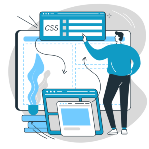
Handling Responsive Design

Testing and Debugging:

Regularly test and preview your CSS customizations on different browsers and devices to ensure consistent rendering. Use browser developer tools to debug and resolve any issues with your CSS code.

CSS is a powerful tool for customizing the appearance of your WordPress theme. You can modify colors, fonts, layouts, and more by understanding CSS basics to create a unique and personalized website. Remember to inspect elements, use selectors effectively, modify colors and fonts, adjust layouts, style links, customize images, handle responsive design, and test your CSS code. With these fundamental CSS skills, you can unleash your creativity and bring your WordPress theme customization ideas to life.

Advanced Theme Customization Techniques for Designers

Advanced Theme Customization Techniques for Designers

As a designer, you have a keen eye for aesthetics and a desire to create visually stunning websites. Advanced theme customization techniques allow you to take your WordPress designs to the next level, transforming the appearance and functionality of your chosen theme. This blog post will explore advanced theme customization techniques that empower designers to create unique and captivating websites.

Child Themes:

Utilize child themes to maintain the integrity of your design while preserving the updates and security of the parent theme. Child themes provide a safe and efficient way to customize themes without modifying the core files. This ensures your customizations remain intact even when the parent theme is updated.

Custom Templates:

Create custom templates to achieve unique layouts for specific pages or sections of your website. By creating custom template files, you can control the design and structure of pages beyond the default templates provided by the theme. This empowers you to tailor the visual experience to your specific design vision.

Custom Page Templates

Custom Post Types:

Leverage custom post types to extend the functionality of your website beyond standard posts and pages. With custom posts, you can create and design unique content structures for various purposes, such as portfolios, testimonials, events, or products. Custom post types allow for more flexible and visually appealing content presentation.

Advanced CSS Techniques:

Go beyond basic CSS modifications and explore advanced techniques to create intricate designs. Learn about CSS animations, transitions, transforms, and keyframe animations to add dynamic and visually engaging elements to your website. Combine these techniques with responsive design principles for a seamless device user experience.

JavaScript Enhancements:

Enhance your theme customization with JavaScript. Utilize JavaScript libraries, such as jQuery or React, to add interactivity, animations, and dynamic functionality to your website. JavaScript opens up possibilities for your designs, from creating interactive menus to implementing advanced sliders and carousels.

Customizing Theme Elements:

Dive deeper into theme customization by customizing individual elements. Use CSS and JavaScript to modify the header, footer, navigation menus, widgets, or any other theme element. This level of customization allows you to create cohesive and consistent designs that align with your overall vision.

Prioritize Customization Options

Integrating Custom Fonts:

Typography plays a crucial role in design. Incorporate custom fonts to add a unique touch to your website. Explore web font services like Google Fonts or Adobe Fonts to find and integrate a wide range of font options into your theme. Custom fonts help create a distinctive visual identity for your designs.

Customizing WooCommerce:

For e-commerce websites, take advantage of WooCommerce customization options. Design visually appealing product pages, shopping carts, checkout processes, and product listings that align with your overall theme design. Customize WooCommerce templates and styles to create a seamless and branded shopping experience.

Implementing Advanced Grid Systems:

Explore advanced grid systems like CSS Grid or Flexbox to create complex and flexible layouts. These grid systems enable you to easily design multi-column, responsive, and asymmetrical layouts. Implementing advanced grid systems helps you achieve intricate and visually appealing designs that break away from traditional grid structures.

Collaborating with Developers:

Collaboration with developers can take your theme customization to new heights. Work closely with developers to implement advanced functionalities, optimize performance, and overcome technical challenges. By combining your design expertise with the technical skills of developers, you can create great websites.

Collaboration with Developers

Advanced theme customization techniques empower designers to go beyond the standard boundaries of WordPress themes, creating unique and captivating websites. By leveraging child themes, custom templates, custom post types, advanced CSS techniques, JavaScript enhancements, custom fonts, WooCommerce customization, advanced grid systems, and collaborating with developers, designers can push the boundaries of their designs and create visually stunning websites that leave a lasting impression.

Free vs. Premium Plugins

Free vs. Premium Plugins: Pros and Cons

When building a WordPress website, choosing the right plugins is essential for adding functionality and enhancing the user experience. However, you’re faced with deciding whether to use free plugins or invest in premium ones. This article will explore the pros and cons of free and premium plugins, helping you decide when to select the best plugins for your WordPress website.

Pros and Cons of Free Plugins:

Pros:

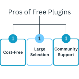
Cost-Free: Free plugins are, well, free! They can be downloaded and used without any upfront cost, making them an attractive option for those on a tight budget.

Large Selection: The WordPress Plugin Directory offers various free plugins covering various functionalities. You’ll find options for SEO, security, contact forms, social media integration, and more.

Community Support: Free plugins often have an active community of users who provide support, updates, and troubleshooting assistance.

Pros of Free Plugins

Cons:

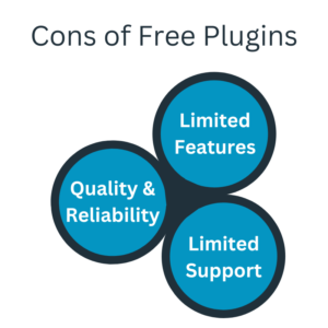
Limited Features: Free plugins may need more functionality than their premium counterparts. They may need more advanced features or customization options, which can restrict the level of customization you desire.

Quality and Reliability: Not all free plugins undergo the same quality control and testing level as premium plugins. Some free plugins may need better coding, leading to compatibility issues or potential security vulnerabilities.

Limited Support: While community support is available for free plugins, it may be less comprehensive and timely than the support provided by premium plugin developers.

Cons of Free Plugins

Pros and Cons of Premium Plugins:

Pros:

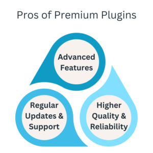
Advanced Features: Premium plugins often offer a wider range of features, customization options, and advanced functionality. They are designed to meet specific needs and provide more comprehensive solutions.

Regular Updates and Support: Premium plugins typically have regular updates, bug fixes, and security patches. Developers offer dedicated support to assist with troubleshooting, customization, and addressing any issues that may arise.

Higher Quality and Reliability: Premium plugins undergo more rigorous testing and quality control measures, ensuring a higher level of reliability, compatibility, and overall performance.

Pros of Premium Plugins

Cons:

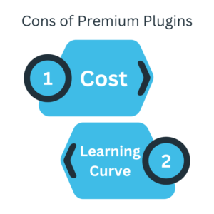
Cost: Premium plugins come at a cost, with prices varying depending on the plugin’s complexity and capabilities. Cost can add to your overall website development budget.

Learning Curve: Premium plugins often have more advanced features and customization options, possibly requiring a learning curve to utilize and configure fully. They may have more extensive documentation and tutorials to assist with the setup and customization.

Cons of Premium Plugins

When choosing between free and premium plugins for your WordPress website, consider your specific needs, budget, and level of customization required. Free plugins offer a cost-effective solution with a wide selection, but they may need more advanced features and extensive support. On the other hand, premium plugins provide more comprehensive functionality, reliable support, and regular updates, but at a price. It’s important to assess the pros and cons based on your website’s requirements and choose plugins that best align with your goals and budget.

Designing a User-Friendly Navigation Menu in WordPress

Designing a User-Friendly Navigation Menu in WordPress

The navigation menu is an important website component, serving as a roadmap for visitors to explore your content. Designing a user-friendly navigation menu in WordPress is essential for providing a seamless browsing experience and helping visitors find the information they need quickly. This post will delve into tips and best practices for creating a user-friendly navigation menu in WordPress that enhances usability and improves overall website navigation.

Keep it Simple and Concise:

A cluttered navigation menu can overwhelm visitors and make finding what they’re looking for challenging. Keep your menu simple and concise by including only the most important and relevant pages or categories. Use clear and concise labels that accurately represent the content behind each link.

Simple and Concise Navigation Menu

Organize Menu Items Hierarchically:

Organize your menu items hierarchically to create a logical structure. Use parent and child menu items to create dropdown or flyout menus for subpages or subcategories. This helps visitors understand the relationship between different sections of your website and allows for a more intuitive browsing experience.

Use Clear and Descriptive Labels:

Ensure that your menu labels are clear, descriptive, and easily understandable. Avoid using jargon or industry-specific terms that may confuse visitors. Use language that aligns with your target audience’s vocabulary and expectations. Consider conducting user testing or gathering feedback to validate the clarity and effectiveness of your menu labels.

Limit the Number of Menu Items:

Too many menu items can overwhelm visitors and make finding what they’re looking for difficult. Limit the number of items in your navigation menu to the most important sections of your website. Consider grouping pages under relevant categories or utilizing dropdown menus to maintain a clean and organized navigation structure if you have numerous pages.

Ensure Responsive Design:

In today’s mobile-centric world, ensuring your navigation menu is mobile-friendly and responsive is crucial. Opt for a responsive WordPress theme that automatically adjusts the menu for different screen sizes. Test your menu on various devices and screen resolutions to ensure smooth navigation and easy access to menu items.

Responsive Design

Highlight the Current Page:

Make it easy for visitors to identify their current location on your website by highlighting the active or current page in the navigation menu. This visual cue helps users orient themselves and improves overall navigation. Consider using a different color, underlining, or bold font to distinguish the active page from the rest of the menu items.

Include a Search Bar:

Consider including a search bar in your navigation menu to further enhance navigation convenience. This lets users quickly search for specific content or products without browsing the entire menu. Place the search bar prominently at the top of the menu or in a visible location on your website.

Optimize Menu Placement:

Carefully consider the placement of your navigation menu on your website. Traditionally, the menu is positioned horizontally across the top of the page. Still, you can also experiment with alternative placements, such as a vertical sidebar menu or a sticky header menu. Choose a placement that maximizes visibility and usability without obstructing the main content.

Analyze User Data:

Leverage analytics tools to gather data on user behavior and navigation patterns. Analyze metrics like bounce rate, time spent on different pages, and conversion rates to identify navigation issues or bottlenecks. Use this data to make data-driven decisions and improve your navigation menu accordingly.

Analyze and Refine

Regularly Test and Refine:

Don’t consider your navigation menu a one-time design element. Regularly test and gather feedback on its usability and effectiveness. Monitor user behavior, conduct A/B testing, and gather user feedback to identify pain points or improvement areas. Continuously refine your navigation menu based on these insights to ensure an optimal user experience.

Designing a user-friendly navigation menu enhances website usability and visitor experience. By keeping it simple, organizing menu items hierarchically, using clear labels, ensuring responsiveness, highlighting the current page, and incorporating user feedback, you can create a navigation menu that guides visitors seamlessly through your website. Invest time and effort in designing and refining your navigation menu to provide an intuitive and user-friendly browsing experience for your WordPress website visitors.

Visuals to Enhance Your Content Image and Video Best Practice

Visuals to Enhance Your Content: Image and Video Best Practice

In today’s visually-driven digital landscape, incorporating high-quality visuals into your content is essential for capturing and retaining your audience’s attention. Visuals such as images and videos can enhance the impact and engagement of your content. This blog post will explore best practices for using visuals to enhance your content, including tips for selecting, optimizing, and effectively integrating images and videos into your digital content strategy.

Selecting Relevant and High-Quality Visuals:

Choose relevant visuals for your content and align them with your brand’s style and messaging. Use high-quality images and videos that are clear, well-composed, and visually appealing. Ensure that the images and videos accurately convey the intended message and evoke the desired emotional response from your audience.

Selecting Relevant and High-Quality Visuals

Optimizing Image File Sizes and Formats:

Optimize your images to ensure fast loading and a better user experience. Compress your image files without compromising their quality using tools like Adobe Photoshop, TinyPNG, or Squoosh. Choose the right file format, such as JPEG for photographs and PNG for transparent images. Aim for a balance between file size and image quality.

Adding Alt Text and Descriptive Captions:

Provide alt text for your images to improve accessibility and help search engines understand their content. Alt text should be descriptive, include keywords, and accurately represent the image. Additionally, consider adding descriptive captions to provide context and further engage your audience.

Embedding Videos Responsively:

When embedding videos, ensure they are responsive and compatible with different devices and screen sizes. Use responsive design techniques or embed codes from video hosting platforms like YouTube or Vimeo. This ensures that your videos adjust dynamically to fit the available space without affecting the overall user experience.

Incorporating Visuals Strategically:

Strategically place visuals throughout your content to break up text and make it more visually engaging. Use visuals to support or illustrate key points, convey complex concepts, or evoke emotions. Consider using eye-catching images and videos at the beginning to grab attention and intersperse them throughout the content to maintain interest.

Incorporating Visuals Strategically

Optimizing Video Length and Quality:

Keep your videos concise and focused on delivering value to your audience. Avoid unnecessary lengthy introductions or filler content. Ensure your videos are of high quality, with clear audio and visuals. Consider adding subtitles or captions to accommodate viewers who prefer to watch videos without sound or have hearing impairments.

Branding Your Visuals:

Maintain consistent branding by adding your logo, watermark, or consistent color scheme to your images and videos. This helps reinforce brand recognition and establishes a cohesive visual identity across your content. However, ensure the branding elements stay within the main content.

Providing Proper Attribution:

If you use images or videos from external sources, ensure you provide proper attribution and respect copyright laws. Use royalty-free or Creative Commons-licensed images and videos, or purchase stock photos and videos from reputable platforms. Properly attribute the creators or sources according to the specified guidelines.

Testing and Analyzing Visual Performance:

Regularly monitor the performance of your visuals through analytics tools. Track metrics such as engagement, click-through rates, or time spent on pages with visuals. Test different types of visuals, placements, or formats to determine what resonates best with your audience. Use the insights gained to optimize your visual content strategy.

Testing and Analyzing Visual Performance

Ensuring Mobile-Friendly Visual Experience:

With increasing users accessing content on mobile devices, ensure that your visuals are mobile-friendly. Optimize image sizes for mobile screens, use responsive design principles for videos, and test your visuals on different devices and screen sizes to ensure they are easily viewable and accessible.

Visuals play an important factor in enhancing the impact and engagement of your content. By selecting relevant and high-quality images and videos, optimizing image file sizes, adding alt text and descriptive captions, embedding videos responsively, incorporating visuals strategically, optimizing video length and quality, branding your visuals, providing proper attribution, testing and analyzing visual performance, and ensuring a mobile-friendly visual experience, you can effectively leverage images and videos to elevate your content and captivate your audience.

Web Copywriting Writing Persuasive Content for Conversions

Web Copywriting: Writing Persuasive Content for Conversions

In the competitive digital landscape, writing persuasive web copy is crucial for capturing your audience’s attention, engaging them, and ultimately driving conversions. Effective web copywriting involves:

  • Crafting compelling and persuasive content convinces visitors to take desired actions, such as purchasing.
  • Signing up for a newsletter.
  • Filling out a form.

In this blog post, we will explore the art of web copywriting and provide valuable tips and strategies for creating persuasive content that leads to higher conversion rates.

Understand Your Target Audience:

Before writing persuasive web copy, it’s essential to understand your target audience. Conduct thorough research to understand their needs, pain points, desires, and motivations. Understand their language, preferences, and challenges. Tailor your copy to resonate with their specific needs and aspirations.

Understand Your Target Audience

Highlight the Benefits:

Concentrate on the advantages that your product or services offer to the audience. Communicate how it solves their problems, improves their lives, or fulfills their desires. Use persuasive language to emphasize the value they will gain from choosing your offering. Show how it addresses their pain points and provides solutions.

Craft Compelling Headlines and Subheadings:

Capture attention from the start with compelling headlines and subheadings. Use strong, action-oriented words, power words, and emotional triggers to pique curiosity and entice readers to continue reading. Communicate the value proposition and unique selling points in these attention-grabbing elements.

Create Clear and Concise Copy:

Create a clear, concise text that is easy to read and digest. Use short sentences and paragraphs to maintain readability. Avoid jargon or complex language that may confuse or alienate your audience. Focus on delivering your message straightforwardly and compellingly.

Use Persuasive Calls-to-Action (CTAs):

Incorporate persuasive calls-to-action (CTAs) throughout your web copy. Tell your audience what action you want them to take and why they should take it. Use action verbs and create a sense of urgency or exclusivity. Make your CTAs stand out visually and position them strategically within your content.

Use Persuasive Calls-to-Action (CTAs)

Incorporate Social Proof:

Include social proof elements to build trust and credibility. Testimonials, case studies, customer reviews, and success stories can all help persuade visitors to trust your brand and take action. Highlight positive feedback, endorsements, or statistics that demonstrate the effectiveness or popularity of your offering.

Utilize Scarcity and FOMO:

Create a strong sense of urgency, and create a fear that you will miss out on something (FOMO) to motivate conversions. Limited-time offers exclusive deals, or special discounts can incentivize visitors to act immediately. Communicate scarcity by mentioning limited stock availability, spots, or limited-time promotions.

Optimize for Search Engines:

Ensure your web copy is optimized for search engines to improve organic visibility. Conduct keyword research and strategically incorporate relevant keywords in your copy. However, prioritize writing for humans rather than search engines. Create valuable, informative content that appeals to both search engines and readers.

Address Objections and Overcome Barriers:

Anticipate and address common objections or barriers that may prevent visitors from converting. Incorporate persuasive copy that overcomes these objections and provides reassurance. Offer guarantees, free trials, or money-back guarantees to reduce perceived risks and instill confidence in your offering.

Address Objections and Overcome Barriers

Test and Refine Your Copy:

Continuously test and refine your web copy to improve conversion rates. Use A/B testing to compare different variations of your copy and identify which elements resonate best with your audience. Measure the effectiveness of your copy by monitoring analytics data like bounce rates, click-through rates and conversion rates.

Web copywriting is a powerful tool for persuading and converting website visitors into customers. By understanding your target audience, highlighting the benefits, crafting compelling headlines, creating clear and concise copy, using persuasive CTAs, incorporating social proof, utilizing scarcity and FOMO, addressing objections, optimizing for search engines, and continuously testing and refining your copy, you can create persuasive web content that drives conversions and achieves your business goals.

Responsive Design Making Your WordPress Site Mobile-Friendly

Responsive Design: Making Your WordPress Site Mobile-Friendly

With the ever-increasing use of mobile devices for web browsing, ensuring that your WordPress website is mobile-friendly is no longer an option—it’s a necessity. Responsive design is essential to modern web development, allowing your website to adapt and provide an optimal viewing experience across various screen sizes and devices. This article will explore the importance of responsive design and provide actionable tips to make your WordPress site mobile-friendly.

Understanding Responsive Design:

Responsive design is a way of web design that aims to create a seamless and user-friendly experience across different devices and screen sizes. Rather than creating separate versions of your website for desktop and mobile, responsive design enables your website to automatically adjust its layout, content, and functionality based on the device accessing it.

Understanding Responsive Design

Choose a Responsive Theme:

Choosing a responsive theme is the first step when building a mobile-friendly WordPress site. A responsive theme is designed to adapt and provide an optimal user experience on all devices. Please explore the extensive selection of responsive themes offered in the WordPress theme directory, or alternatively, consider investing in a premium theme that specifically highlights its responsiveness.

Optimize Images for Mobile:

Images play a crucial role in your website’s visual appeal. Still, they can also slow down loading times, especially on mobile devices. Optimize your images by compressing them without compromising quality. Additionally, utilize responsive image techniques, such as the srcset attribute, to deliver appropriately sized photos based on the user’s device.

Simplify Navigation:

Navigation menus can become challenging on smaller screens if they are not optimized. Simplify your navigation menu by using clear and concise labels, collapsing menus into a hamburger icons for mobile devices, and utilizing dropdown or off-canvas menus. Make it easy for users to find the information they seek with minimal effort.

Simplify Navigation

Prioritize Content for Mobile:

When designing your WordPress site for mobile, prioritize the most critical content to ensure it is prominently displayed. Users on mobile devices have limited screen real estate, so focus on delivering essential information and call-to-action elements upfront. Consider displaying important content above the fold and minimizing the need for excessive scrolling.

Optimize Typography for Readability:

Readability is paramount on mobile devices, where screen sizes are smaller. Choose a legible font size and line height to ensure comfortable reading. Avoid using small fonts or long paragraphs that can strain the eyes. Also, consider using responsive typography techniques that adjust the font size and line spacing based on the device.

Test Across Devices:

To ensure your WordPress site is mobile-friendly, test it across various devices and screen sizes. Emulators and browser tools can provide a general idea, but nothing beats testing on actual devices. Check how your website renders on smartphones, tablets, and different-sized screens. Pay attention to responsiveness, font sizes, button sizes, and image placement.

Utilize Responsive Design Plugins:

WordPress offers an extensive range of plugins that can assist in achieving responsive design. Plugins like WPtouch and Jetpack’s Mobile Theme allow you to create mobile-specific versions of your site. In contrast, plugins like Elementor and Divi offer built-in responsive design features for easy customization.

Regularly Update and Optimize:

Mobile devices and browsers evolve constantly, so it’s vital to keep your WordPress site up to date. Regularly update your theme, plugins, and WordPress core to ensure compatibility with the latest mobile technologies. Optimize your site’s performance by minifying CSS and JavaScript files, leveraging browser caching, and enabling compression.

User Testing and Feedback:

Finally, don’t forget to gather user feedback on your website’s mobile experience. Encourage users to provide feedback, conduct user testing sessions, or utilize heat mapping tools to gain insights into user behavior. This feedback will help you identify any areas for improvement and refine the mobile experience of your WordPress site.

User Testing and Feedback

In today’s mobile-centric digital landscape, having a mobile-friendly WordPress site is essential for providing an optimal user experience and reaching a wider audience. By embracing responsive design principles, choosing a responsive theme, optimizing images and typography, simplifying navigation, and regularly testing and updating your site, you can ensure that your WordPress site delivers a seamless experience on all devices. Make your WordPress site mobile-friendly and stay ahead in the mobile-first era.

Customizing Your WordPress Website Tips and Tricks

Customizing Your WordPress Website: Tips and Tricks

WordPress’s flexibility and customization options make it a powerful platform for creating unique and personalized websites. Customizing themes, plugins, and various elements allow you to tailor your WordPress website to align with your brand identity and achieve your specific goals. In this blog post, we’ll explore tips and tricks to help you customize your WordPress website effectively, making it stand out.

Start with a Child Theme:

When customizing your WordPress website, using a child theme is essential instead of modifying the parent theme directly. A child theme allows you to change the appearance and functionality without affecting the parent theme’s core files. This ensures that your customizations remain intact even after theme updates.

Child Theme

Customize the Theme’s Appearance:

Customizing the visual elements of your theme is vital to creating a unique website. Explore the theme customization options provided by your chosen theme. This may include options for colours, fonts, layouts, headers, and footers. Make use of these settings to align the piece with your brand’s visual identity.

Take Advantage of Custom CSS:

You can use Custom CSS to make specific styling changes beyond the built-in customization options. WordPress provides a dedicated Custom CSS field or allows you to use a plugin like Simple Custom CSS. With CSS knowledge or the help of a developer, you can make targeted design modifications to various elements of your website.

Utilize Page Builders:

Page builders are powerful tools that allow you to create and customize pages with a drag-and-drop interface. They provide pre-designed elements and layouts, making it easy to create visually appealing pages without coding. Popular page builders like Elementor, Divi, and Beaver Builder offer extensive customization options and flexibility.

Utilize Page Builders

Customize Navigation Menus:

Navigation menus play a vital role in guiding visitors through your website. Customize your menus to reflect your website’s structure and content hierarchy. WordPress allows you to create multiple menus and assign them to different locations on your site. You can also add custom links, dropdowns, and even mega menus for enhanced navigation.

Add Custom Widgets:

Widgets are handy tools to add functionality and features to your website’s sidebars, footers, or other widget areas. WordPress provides several default widgets, such as search, recent posts, and categories. Additionally, you can explore plugins that offer custom widgets specific to your needs. Consider adding widgets for social media feeds, newsletter subscriptions, or testimonials.

Integrate Custom Post Types:

Custom post types allow you to create content beyond the standard posts and pages. This is particularly useful if you have specific content types like portfolios, testimonials, events, or products. Utilize plugins like Custom Post Type UI or Toolset to create custom post types and customize their display on your website.

Enhance Functionality with Plugins:

Plugins are a great way to add extra functionality to your WordPress website. Explore the vast plugin repository and identify plugins that align with your customization goals. Whether adding a contact form, creating sliders, or incorporating social media feeds, plugins offer endless possibilities to enhance your website’s functionality.

WordPress Plugins

Optimize for Mobile Devices:

In today’s mobile-centric world, ensuring your website looks great and functions seamlessly on smartphones and tablets is crucial. Choose a responsive theme that automatically adjusts to different screen sizes. Check your website on various devices to ensure proper display and user experience.

Test and Iterate:

After customizing your WordPress website, thoroughly test all aspects to ensure everything works as intended. Check for any design inconsistencies, broken links, or functionality issues. Solicit feedback from users and make necessary adjustments based on their input. Customization is an ongoing process, and you can continuously refine and improve your website over time.

Customizing your WordPress website allows you to create a unique online presence that represents your brand and meets your specific needs. Following these tips and tricks can effectively customize your website’s appearance, functionality, and user experience. Remember to use child themes, explore customization options, leverage page builders and plugins, and optimize for mobile devices. With careful customization, your WordPress website will stand out, engage visitors, and achieve your desired objectives.

The All-in-One Solution How WordPress Empowers Websites of All Sizes

WordPress Empowers Websites: The All-in-One Solution

When it comes to website creation and management, WordPress has emerged as a leading platform, empowering individuals and businesses of all sizes to establish a powerful online presence. In this blog, we will explore the diverse applications of WordPress, who can benefit from its features, how it can be scaled up to meet the needs of growing businesses and the advantages it offers to big enterprises. By the end of this article, you will clearly understand how it can be a valuable tool for your website, whether you choose to DIY or seek professional assistance.

Who Uses WordPress?

WordPress is not limited to any specific user group but is embraced by a vast community that includes bloggers, freelancers, small business owners, nonprofits, creative professionals, and even large enterprises. It has evolved into a variable content management system(CMS) that caters to many users. It can accommodate your needs whether you are a solopreneur starting a personal blog or a multinational corporation seeking an enterprise-level solution.

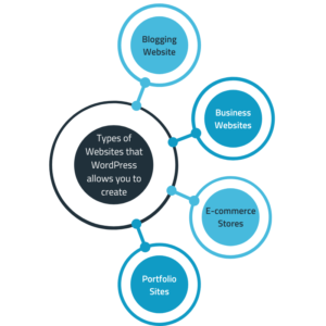
Types of Websites that WordPress allows you to create

WordPress is highly flexible and adaptable, allowing the creation of various types of websites. The possibilities are endless, from simple blogs, business websites, e-commerce stores, portfolio sites, and membership sites to news portals and online communities. Its extensive theme library and customizable features suit virtually any website concept. Let’s delve into a few examples:

Blogging Websites: WordPress’s origins lie in blogging, which continues to be a popular choice for bloggers worldwide. With its user-friendly interface and a wide selection of blogging-focused themes and plugins. WordPress provides an excellent CMS for content creators to share their thoughts and engage with their audience.

Business Websites: Small businesses, startups, and local enterprises can leverage WordPress to establish an effective online presence. With themes specifically designed for businesses, you can showcase your products, services, and company information professionally and visually appealingly.

E-commerce Stores: WordPress, in combination with the WooCommerce plugin, enables the creation of powerful online stores. You can customize your shopping experience, sell digital or physical products, manage inventory and payments, and customize how you shop to suit your business needs.

Portfolio Sites: Artists, photographers, designers, and creative professionals can showcase their work using WordPress. With its wide range of portfolio-focused themes, customizable galleries, and multimedia support, WordPress offers a visually stunning platform to highlight your creative endeavors.

"Types

Scaling Up with WordPress

One of the remarkable aspects of WordPress is its ability to scale alongside your business growth. It can accommodate your evolving needs, whether you start with a small website or have expansion plans. As your business grows, you can add new pages, incorporate advanced features, and expand your website’s functionality. With its robust plugin ecosystem, you can integrate CRM systems, lead generation tools, analytics platforms, and more to enhance your website’s capabilities.

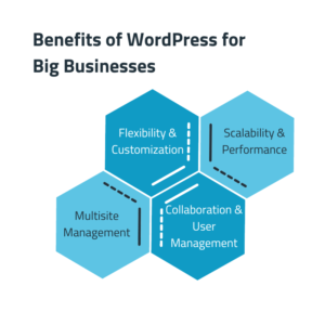
Benefits of WordPress for Big Businesses

Contrary to popular belief, WordPress is open to more than small-scale projects. Big enterprises can harness the power of WordPress to build and manage their digital presence. Here are some key advantages for big businesses:

Flexibility and Customization: WordPress offers unparalleled flexibility, allowing businesses to customize their website’s design, features, and functionalities. With access to thousands of themes and plugins, you can tailor your website to align. With your brand identity and create a unique online experience for your customers.

Scalability and Performance: WordPress can handle high traffic volumes and complex websites, making it suitable for enterprise-level requirements. It can deliver excellent performance even under heavy loads with proper optimization, caching mechanisms, and hosting infrastructure.

Multisite Management: Big businesses often require multiple websites for various brands, divisions, or geographical locations. WordPress’s multisite feature enables centralized management of multiple websites from a single dashboard, streamlining updates, security, and content management.

Collaboration and User Management: WordPress provides robust user management capabilities, allowing big businesses to assign different roles and permissions to team members. Collaboration and User Management ensure controlled access to website resources, collaboration on content creation, and streamlined workflows.

"Benefits

WordPress has cut across its origins as a blogging platform. To become a powerful CMS that caters to the needs of personal, small businesses, and big enterprises alike. Whether you are a blogger, an entrepreneur, or a corporate entity, it offers the versatility, scalability, and customization options to bring your vision to life. You can DIY your website using the vast resources available. Or you can seek professional assistance to create a tailor-made solution that aligns with your goals. Embrace the power of WordPress, and unlock endless possibilities for your online presence. Contact us to build your amazing website on WordPress.
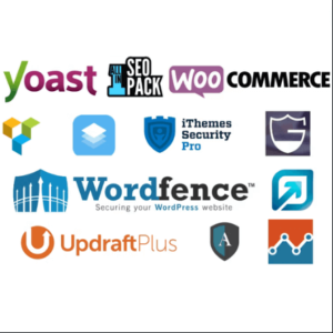
The Power of CTA Buttons Driving Sales and Conversions

The Power of Call-To-Action Buttons: Driving Sales and Conversions

In web design and digital marketing, Call-To-Action (CTA) buttons drive user engagement, increase conversions, and ultimately boost sales. In this blog post, we will explore the significance of CTA buttons, their visual appearance, and how they add value to websites by encouraging user actions and generating leads.

What are Call-To-Action Buttons?

Call-To-Action buttons are strategically placed elements on a website that prompt users to take a specific action. They serve as clear and compelling invitations for visitors to engage with a brand, purchase, subscribe to a newsletter, request a quote, or perform any desired action that aligns with the website’s objectives.

The Visual Appearance of CTA Buttons:

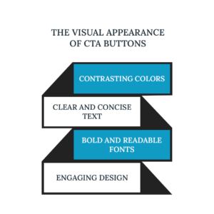
CTA buttons are designed to stand out and grab the attention of website visitors. They typically exhibit the following visual characteristics:

a) Contrasting Colors: CTA buttons often use colors that contrast with the website’s color scheme to make them highly visible and easily noticeable.

b) Clear and Concise Text: CTA button text should be concise, action-oriented, and specific. Examples include “Buy Now,” “Sign Up,” “Download Now,” or “Get Started.”

c) Bold and Readable Fonts: The text on CTA buttons should be displayed using bold, easy-to-read font, even in smaller sizes.

d) Engaging Design: Incorporating graphical elements, such as arrows or icons, can enhance the visual appeal of CTA buttons and make them more enticing to click.

The Visual Appearance of CTA Buttons

Increasing Sales and Generating Leads:

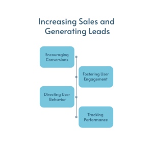
CTA buttons are powerful tools for driving sales and generating leads. Here’s how they add value to websites:

a) Encouraging Conversions: CTA buttons provide a clear pathway for visitors to take the desired action. By strategically placing them in prominent positions on your website. You guide users toward the next step in their customer journey, increasing the likelihood of conversions.

b) Fostering User Engagement: Well-designed CTA buttons capture users’ attention and compel them to interact with your website. Whether purchasing, subscribing to a service, or filling out a contact form, CTAs encourage users to engage actively with your brand.

c) Directing User Behavior: Using persuasive and actionable language, CTA buttons guide users towards specific actions that align with your business objectives. They direct users to perform the desired action, reducing friction and making it easier for them to convert.

d) Tracking Performance: CTA buttons can be tracked using analytics tools, providing valuable insights into their effectiveness. You can fine-tune your CTAs to optimize performance and drive better results by analyzing click-through rates, conversion rates, and user behavior.

Increasing Sales and Generating Leads

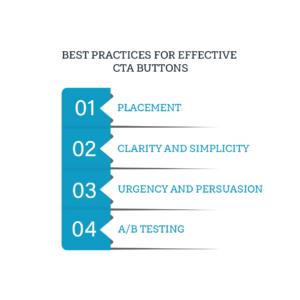
Best Practices for Effective CTA Buttons:

To maximize the impact of your CTA buttons, consider the following best practices:

a) Placement: Position CTAs strategically in visible areas of your website, such as the header, sidebar, or above-the-fold sections.

b) Clarity and Simplicity: Ensure your CTA text is concise, compelling, and easy to understand. Avoid ambiguity and provide clear instructions on what users can expect when they click the button.

c) Urgency and Persuasion: Created a sense of urgency by using phrases like “Short Time Offer” or “Act Now.” Incorporate persuasive language to encourage immediate action.

d) A/B Testing: Test different variations of your CTA buttons to determine which design, placement, or text yields the highest conversion rates. Continuously optimize based on data-driven insights.

Best Practices for Effective CTA Buttons

Conclusion:

Call-To-Action buttons are powerful tools that drive user engagement, increase conversions, and generate leads. By strategically designing and placing compelling CTAs on your website. You can guide visitors toward specific actions, increase sales, and achieve your business goals. At Webmaster Solutions, we specialize in optimizing websites with effective CTAs that deliver tangible results. Contact us to leverage the power of CTAs and enhance your website’s performance and conversions.