Creating Engaging Landing Pages with WordPress
Landing pages have become a powerful tool for capturing leads and promoting services or products. They also help to drive conversions. With WordPress, you can create visually appealing and engaging landing pages that effectively communicate your message and entice visitors to take action. In this post, we’ll explore the tips and techniques you can use to create stunning landing pages in WordPress. This will help maximize your website conversion.
Define Your Landing Page Goal:
Before diving into design and content, clearly define the goal of your landing page. Is it to generate leads, promote a product, or encourage sign-ups? Knowing your objective will help you structure your page effectively and create targeted content that resonates with your audience.

Choose a High-Quality Landing Page Theme:
Selecting the right WordPress theme is crucial for creating engaging landing pages. Look for themes specifically designed for landing pages or those that offer page builder compatibility. These themes often provide pre-designed sections and layouts that make creating visually appealing and conversion-focused landing pages easier.
Utilize a Page Builder Plugin:
Page builder plugins like Elementor, Divi, or Beaver Builder offer drag-and-drop functionality and pre-designed elements, making creating stunning landing pages without coding knowledge easy. These plugins are easy to use and allow you to customize every aspect of the landing page. This allows you to create a unique look that aligns with your brand.
Craft a Clear and Compelling Headline:
Your landing page headline should immediately grab visitors’ attention and convey the value proposition clearly. Make it concise, compelling, and aligned with your offer. Use powerful words and address your target audience’s pain points or desires. A strong headline sets the tone for the rest of the page and entices visitors to explore further.
Use High-Quality Visuals:
Visual elements are crucial in engaging visitors and conveying your message effectively. Incorporate high-quality images, videos, or graphics relevant to your offer. Visuals should support your content and help visitors understand the value and benefits of your offer at a glance.

Create Persuasive and Benefit-Oriented Content:
Craft persuasive and benefit-oriented content that highlights the unique selling points of your offer. Communicate how your product or service solves a problem or fulfills a need. Use bullet points, subheadings, and short paragraphs to make the content of your article scannable. To build trust and credibility, incorporate testimonials, case studies, or social proof.
Utilize Clear Call-to-Action (CTA) Buttons:
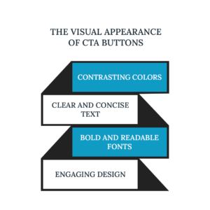
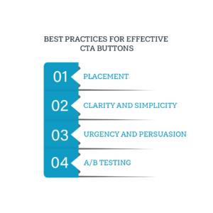
Place clear and prominent call-to-action buttons on your landing page. Use contrasting colors and compelling text to make them stand out. Your CTA should be action-oriented and explicitly state what visitors will get by clicking. Consider incorporating urgency or scarcity elements to encourage immediate action.
Integrate Contact Forms and Lead Generation Tools:
Capture visitor information by integrating contact forms or lead-generation tools on your landing page. Keep the form fields minimal, asking only for essential information. Position the form strategically, preferably above the fold or after providing the initial value. Use an email marketing service like Mailchimp or ConvertKit to collect and manage leads effectively.
Optimize Your Landing Page for Mobile:
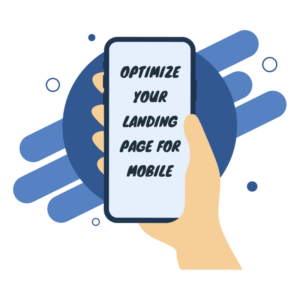
In today’s mobile-first world, optimizing your landing page is crucial. Ensure your landing page is responsive and displays correctly on different screen sizes. Test its performance and usability on mobile devices to deliver mobile visitors a seamless and engaging experience.
A/B Test and Continuously Optimize:
The following are some tips to help you improve the performance of your landing pages:
- Conduct A/B tests to compare different elements and variations.
- Test different headlines, visuals, CTAs, and content layouts to identify what resonates best with your audience.
- Continuously optimize your landing pages based on the insights gained from these tests to maximize conversions.
Creating engaging landing pages with WordPress is within your reach, thanks to the platform’s flexibility and the availability of powerful plugins. By defining your goals, choosing the right theme and plugins, crafting compelling content, utilizing clear CTAs, optimizing for mobile, and continuously testing and optimizing, you can create landing pages that captivate visitors, drive conversions, and help you achieve your marketing objectives. With WordPress, your landing pages can become powerful tools for growing your business and engaging your audience effectively.
