Tag Archive for: responsive design

Posts

Customizing Your WordPress Theme A Beginner's Guide

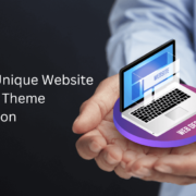
Customizing Your WordPress Theme: A Beginner’s Guide

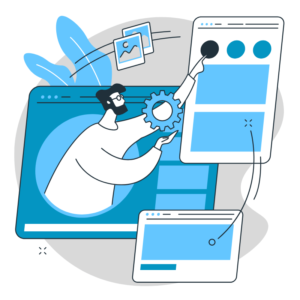
WordPress themes provide the foundation for your website’s visual appearance and layout. While numerous pre-designed themes are available, customizing your WordPress theme allows you to create a unique and personalized website that reflects your brand identity. This guide will explore the process of customizing your WordPress theme and provide helpful tips to get you started.

Choose a Theme that Supports Customization:

Select a WordPress theme that offers customization options and flexibility. Look for themes that provide customization panels, page builders, or theme options that allow you to easily modify colors, fonts, layouts, and other design elements.

Customizable Theme

Customize via the WordPress Customizer:

The WordPress Customizer is a built-in feature that enables you to customize your theme in real time. Access it through the WordPress dashboard under “Appearance” > “Customize.” Here, you can modify various aspects of your theme, such as the site identity, colors, header and footer, menus, and more.

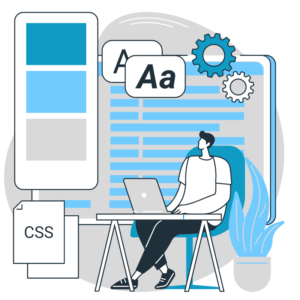
Modify Colors and Typography:

Customize the colors and typography of your theme to align with your brand. Use the Customizer or theme options to change the primary and secondary colors, font styles, sizes, and spacing. Consistent and visually appealing colors and typography enhance the overall aesthetics of your website.

Customize the Header and Footer:

Your website’s header and footer sections play a crucial role in branding and navigation. Customize these sections to include your logo, tagline, social media icons, and menus. Use the Customizer or theme options to modify your header and footer’s layout, style, and content.

Create Custom Menus:

Custom menus allow you to control the navigation structure of your website. In the Customizer, navigate to “Menus” and create menus for different sections of your website. Assign these menus to specific locations, such as the primary navigation, footer, or sidebar, to improve user experience and website navigation.

Custom Menus

Customize the Homepage:

Many themes provide options to customize the homepage layout. Use the Customizer or page builder plugins to arrange and customize sections, such as sliders, featured content, testimonials, or portfolio items. Create a visually appealing and engaging homepage that showcases your key content.

Add Custom Widgets:

Widgets are modular elements that can be added to specific widget areas of your theme, such as the sidebar or footer. Customize your theme by adding custom widgets for search bars, social media feeds, newsletter sign-ups, recent posts, or other content elements. Utilize widget plugins or built-in options to add and configure custom widgets.
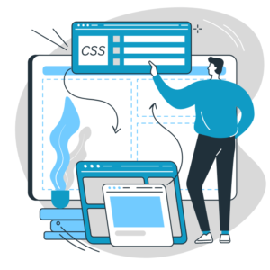
Customize with CSS:

For more advanced customization, you can use custom CSS to override specific styles of your theme. Use the Additional CSS option in the Customizer to add your custom CSS code, or use a child theme to modify CSS. Custom CSS allows you to fine-tune the appearance of your theme to align with your vision.

Modify Page Templates:

WordPress themes often come with pre-defined page templates, such as full-width, blog, or contact page templates. Customize these templates to match your desired layout and style. Modify the template files or use page builder plugins to create unique page layouts with different sections and content blocks.
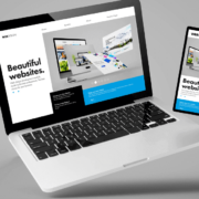
Custom Page Templates

Test and Preview:

Regularly preview and test your customizations on different devices and screen sizes to ensure a responsive and visually appealing website. Use responsive design testing tools or preview your website on various devices to catch layout or display issues.

Customizing your WordPress theme is an exciting process that allows you to create a unique and personalized website. By choosing a customizable theme, using the WordPress Customizer, modifying colors, and typography, customizing the header and footer, creating custom menus, customizing the homepage, adding custom widgets, modifying page templates, using custom CSS, and regularly testing and previewing your customizations, you can create a stunning and customized website that perfectly represents your brand.

Tips for Choosing a Theme with Easy Customization Options

Tips for Choosing a Theme with Easy Customization Options

Selecting the right WordPress theme is crucial for building a website that shows your brand and meets your specific needs. Choosing a theme with easy customization options empowers you to personalize the design, modify functionality, and create a unique online presence. This blog post will provide valuable tips for selecting a theme that offers seamless customization options, ensuring a smooth and efficient website-building process.

Prioritize Customization Options:

When browsing for themes, prioritize those that explicitly highlight their customization options. Look for themes that advertise easy-to-use customization panels, intuitive theme options, or compatibility with popular page builders and customization plugins. Themes that emphasize customization are more likely to provide the flexibility you need.

Prioritize Customization Options

Theme Customization Panel:

A well-designed theme customization panel simplifies modifying key elements of your website. Look for themes that offer an intuitive and user-friendly customization panel, allowing you to customize colours, typography, layouts, and other essential elements. The customization panel should provide real-time previews and various options to suit your design preferences.

Page Builders Compatibility:

Consider themes compatible with popular page builders like Elementor, Divi, or Beaver Builder. Page builders provide a drag-and-drop interface, enabling you to easily create custom layouts and modify content. Compatibility with page builders ensures seamless integration and extends the customization possibilities of your chosen theme.

Customization Plugin Support:

Ensure that the theme supports popular customization plugins, such as Customizer or Visual Composer. Customization plugins offer additional options for modifying various aspects of your website, such as headers, footers, sidebars, and more. The theme’s compatibility with such plugins expands your customization capabilities.

Flexible Layout Options:

Choose a theme that offers a variety of flexible layout options. Look for themes that provide multiple pre-designed layouts or the ability to create custom layouts. Flexible layout options allow you to arrange your content uniquely and adapt the design to your requirements.

Flexible Layout Options

Colour and Typography Customization:

Customizing colours and typography is crucial for maintaining a consistent brand identity. Ensure that the theme allows easy customization of colours, including primary and secondary colours, backgrounds, links, and buttons. Additionally, the theme should provide options to modify font styles, sizes, and weights to achieve the desired typographic look.

Widget and Widget Area Customization:

Widgets offer dynamic content and functionality on your website. Ensure that the theme allows easy customization of widgets and widget areas. Look for themes that provide options for arranging widgets, changing their appearance, or customizing widget areas to fit your content requirements.

Header and Footer Customization:

Headers and footers are key elements of your website’s design. Choose a theme that allows easy customization of header and footer styles. Look for options to modify logo placement, navigation menus, social media icons, copyright text, and other elements within the header and footer areas.

Responsive Design:

In today’s mobile-driven world, responsive design is essential. Ensure your theme is fully responsive and provides a consistent user experience across various devices and screen sizes. Responsive design ensures that your customizations look great on desktops, tablets, and mobile devices.

Responsive Web Design

Read Reviews and Ratings:

Before finalizing your choice, read reviews and ratings of the theme you are considering. Pay attention to feedback regarding customization options, ease of use, and customer support. Reviews provide insights into the user experience and help you make an informed decision.

Choosing a WordPress theme with easy customization options is vital in creating a website that truly reflects your brand and meets your unique requirements. Prioritize themes that offer intuitive customization panels, compatibility with popular page builders and customization plugins, flexible layout options, colour and typography customization, widget and widget area customization, header and footer customization, responsive design, and positive reviews. By following these tips, you can select a theme that simplifies the customization process and empowers you to create a standout online presence.

Creating a Unique Website Design with Theme Customization

Creating a Unique Website Design with Theme Customization

When designing a website, standing out from the crowd is essential. WordPress theme customization provides a powerful toolkit for creating a unique and visually stunning website that reflects your brand identity. This blog post will explore various techniques and strategies for leveraging theme customization to create a truly unique website design.

Choose the Right Theme:

Choose a WordPress theme that suits your design vision and provides the flexibility to customize key elements. Look for themes that offer robust customization options, multiple layout variations, and support for custom post types and page templates.

Choose the Right Theme

Customize Colors and Typography:

Use theme customization settings or custom CSS to modify the colours and typography of your website. Choose a colour palette that aligns with your brand identity and select fonts that convey the desired tone. Consistent and visually appealing colours and typography create a unique and cohesive design.

Personalize the Header and Footer:

Customize your website’s header and footer sections to make a memorable first impression and enhance navigation. Add your logo, tagline, and contact information to the header. Tailor the footer with widgets, social media links, or copyright information. These personalized touches create a unique brand experience.

Custom Post Types and Taxonomies:

Extend the functionality of your website by creating custom post types and taxonomies. This allows you to showcase different types of content, such as case studies, events, or products, in unique ways. Organize your content using custom taxonomies, offering visitors intuitive navigation and a tailored browsing experience.

Custom Page Templates:

Take advantage of custom page templates to design unique layouts for specific pages. Create templates for landing pages, portfolio showcases, team member profiles, or testimonials. Custom page templates allow you to experiment with different layouts and optimize each page’s design for its specific purpose.

Custom Page Templates

Implement Custom Widgets:

Enhance your theme customization by adding custom widgets to your sidebars or widgetized areas. Custom widgets can display featured content, testimonials, or social media feeds. They provide dynamic elements that engage visitors and add a personalized touch to your website.

Integrate Custom Fonts:

Stand out from the crowd by integrating custom fonts into your theme. Choose unique fonts that complement your brand and enhance the overall design. Utilize web font services like Google Fonts or Adobe Fonts to access a wide range of font options and ensure consistent rendering across different devices.

Customize the Navigation Menu:

Create a distinctive navigation menu by customizing its appearance and functionality. Modify colours, add hover effects, or create unique menu layouts. Consider implementing a sticky or mega menu for improved navigation and user experience.

Design Unique Blog Layouts:

Customize your blog layout to showcase your content uniquely and visually appealingly. Experiment with different post formats, grid layouts, or featured images. Use theme customization options or custom page builders to create eye-catching blog designs that resonate with your target audience.

Guest Blogging

Responsive Design and Mobile Optimization:

Ensure your theme customization is responsive and optimized for mobile devices. Check your website on different screen sizes and devices to ensure a seamless user experience. Responsive design guarantees that your unique design remains visually appealing and functional across all devices.

WordPress theme customization empowers you to create a unique website design that reflects your brand identity and captivates your audience. By choosing the right theme, customizing colours and typography, personalizing the header and footer, utilizing custom page templates, implementing custom post types and taxonomies, integrating custom fonts, adding custom widgets, customizing the navigation menu, designing unique blog layouts, prioritizing responsive design and mobile optimization, you can release your creativity and bring your unique website design vision to life.

CSS Basics for WordPress Theme Customization

CSS Basics for WordPress Theme Customization

Customizing the appearance of your WordPress theme requires working with CSS (Cascading Style Sheets). CSS allows you to change colors, fonts, layouts, and visual elements. This will allow you to create your own unique website. This post will teach you how to use CSS for theme customization in WordPress.

Understanding CSS:

CSS is an HTML style sheet that specifies how HTML elements should be displayed on web pages. It consists of selectors, properties, and values. Selectors target specific HTML elements, properties control their appearance, and values define the desired style.

Understanding CSS

Inspecting Elements:

To customize your WordPress theme, you must identify the elements you want to modify. Use the browser’s developer tools, such as the Inspect Element feature, to inspect and identify the HTML structure of your website. This helps you understand the hierarchy and class or ID names of the elements you want to customize.

Using Selectors:

CSS selectors target specific elements for customization. Standard selectors include element selectors (e.g., h1, p), class selectors (e.g., .header, .widget), and ID selectors (e.g., #container, #menu). Combine selectors with properties and values to style elements.

Modifying Colors:

To change colors, use the “color” property to modify text color and the “background-color” property to modify the background color of elements. You can use color names, hexadecimal, RGB, or HSL values to define colors.

Adjusting Fonts:

To modify fonts, specify the desired font by using the “font-family” property. You can choose from web-safe fonts or use custom fonts from external sources. Use the “font-size” property to adjust the font size and “font-weight” to control the font thickness.

Adjusting Fonts

Adjusting Layouts:

CSS allows you to control the layout and positioning of elements. Use properties like “margin” and “padding” to create spacing around elements. The “width and height” properties determine element size. In contrast, “display” and “float” properties control how elements flow within the page.

Styling Links:

Use the “text-decoration” property to modify link styles. You can remove underlines, change colors, or add custom styles when hovering over or clicking links. Use pseudo-classes like “: hover” and “: visited” to target specific link states.

Customizing Images:

CSS provides options to customize the appearance of images. Use the “max-width” property to ensure images fit within their containers and maintain responsiveness. Apply margins and borders to create spacing and define image styles.

Handling Responsive Design:

Responsive design is essential for ensuring your website looks good on different devices. Use CSS media queries to apply specific styles based on the screen size. This allows you to adjust layouts, font sizes, and other properties to optimize the user experience on various devices.

Handling Responsive Design

Testing and Debugging:

Regularly test and preview your CSS customizations on different browsers and devices to ensure consistent rendering. Use browser developer tools to debug and resolve any issues with your CSS code.

CSS is a powerful tool for customizing the appearance of your WordPress theme. You can modify colors, fonts, layouts, and more by understanding CSS basics to create a unique and personalized website. Remember to inspect elements, use selectors effectively, modify colors and fonts, adjust layouts, style links, customize images, handle responsive design, and test your CSS code. With these fundamental CSS skills, you can unleash your creativity and bring your WordPress theme customization ideas to life.

Responsive Design Making Your WordPress Site Mobile-Friendly

Responsive Design: Making Your WordPress Site Mobile-Friendly

With the ever-increasing use of mobile devices for web browsing, ensuring that your WordPress website is mobile-friendly is no longer an option—it’s a necessity. Responsive design is essential to modern web development, allowing your website to adapt and provide an optimal viewing experience across various screen sizes and devices. This article will explore the importance of responsive design and provide actionable tips to make your WordPress site mobile-friendly.

Understanding Responsive Design:

Responsive design is a way of web design that aims to create a seamless and user-friendly experience across different devices and screen sizes. Rather than creating separate versions of your website for desktop and mobile, responsive design enables your website to automatically adjust its layout, content, and functionality based on the device accessing it.

Understanding Responsive Design

Choose a Responsive Theme:

Choosing a responsive theme is the first step when building a mobile-friendly WordPress site. A responsive theme is designed to adapt and provide an optimal user experience on all devices. Please explore the extensive selection of responsive themes offered in the WordPress theme directory, or alternatively, consider investing in a premium theme that specifically highlights its responsiveness.

Optimize Images for Mobile:

Images play a crucial role in your website’s visual appeal. Still, they can also slow down loading times, especially on mobile devices. Optimize your images by compressing them without compromising quality. Additionally, utilize responsive image techniques, such as the srcset attribute, to deliver appropriately sized photos based on the user’s device.

Simplify Navigation:

Navigation menus can become challenging on smaller screens if they are not optimized. Simplify your navigation menu by using clear and concise labels, collapsing menus into a hamburger icons for mobile devices, and utilizing dropdown or off-canvas menus. Make it easy for users to find the information they seek with minimal effort.

Simplify Navigation

Prioritize Content for Mobile:

When designing your WordPress site for mobile, prioritize the most critical content to ensure it is prominently displayed. Users on mobile devices have limited screen real estate, so focus on delivering essential information and call-to-action elements upfront. Consider displaying important content above the fold and minimizing the need for excessive scrolling.

Optimize Typography for Readability:

Readability is paramount on mobile devices, where screen sizes are smaller. Choose a legible font size and line height to ensure comfortable reading. Avoid using small fonts or long paragraphs that can strain the eyes. Also, consider using responsive typography techniques that adjust the font size and line spacing based on the device.

Test Across Devices:

To ensure your WordPress site is mobile-friendly, test it across various devices and screen sizes. Emulators and browser tools can provide a general idea, but nothing beats testing on actual devices. Check how your website renders on smartphones, tablets, and different-sized screens. Pay attention to responsiveness, font sizes, button sizes, and image placement.

Utilize Responsive Design Plugins:

WordPress offers an extensive range of plugins that can assist in achieving responsive design. Plugins like WPtouch and Jetpack’s Mobile Theme allow you to create mobile-specific versions of your site. In contrast, plugins like Elementor and Divi offer built-in responsive design features for easy customization.

Regularly Update and Optimize:

Mobile devices and browsers evolve constantly, so it’s vital to keep your WordPress site up to date. Regularly update your theme, plugins, and WordPress core to ensure compatibility with the latest mobile technologies. Optimize your site’s performance by minifying CSS and JavaScript files, leveraging browser caching, and enabling compression.

User Testing and Feedback:

Finally, don’t forget to gather user feedback on your website’s mobile experience. Encourage users to provide feedback, conduct user testing sessions, or utilize heat mapping tools to gain insights into user behavior. This feedback will help you identify any areas for improvement and refine the mobile experience of your WordPress site.

User Testing and Feedback

In today’s mobile-centric digital landscape, having a mobile-friendly WordPress site is essential for providing an optimal user experience and reaching a wider audience. By embracing responsive design principles, choosing a responsive theme, optimizing images and typography, simplifying navigation, and regularly testing and updating your site, you can ensure that your WordPress site delivers a seamless experience on all devices. Make your WordPress site mobile-friendly and stay ahead in the mobile-first era.

How to Choose the Right WordPress Theme for Your Website

How to Choose the Right WordPress Theme for Your Website

Choosing a suitable WordPress theme is crucial when creating a visually appealing and functional website. With thousands of options available, finding the perfect piece for your needs can be overwhelming. In this blog post, we’ll guide you through selecting a suitable WordPress theme, considering design, functionality, responsiveness, and customization options. Let’s dive in and ensure that your website stands out from the crowd.

Define Your Website’s Purpose and Goals:

Before browsing through the vast array of WordPress themes, it’s essential to define the purpose and goals of your website. Are you creating an e-commerce store, a blog, a portfolio, or a corporate site? Understanding your website’s objectives will help narrow your theme options and ensure a seamless fit.

Consider Design and Visual Appeal:

Aesthetics play a vital role in attracting and engaging visitors. Look for a theme that aligns with your brand identity and conveys the desired mood or atmosphere. Pay attention to colour schemes, typography, and overall layout. Simplicity and readability are vital to consider, as they enhance the user experience.

Consider Design and Visual Appeal

Check Responsiveness and Mobile Compatibility:

In the age of mobile browsing, it’s crucial to choose a responsive theme that displays well on various devices and screen sizes. Mobile compatibility improves user experience and contributes to better search engine rankings. Ensure that the piece you select is optimized for mobile devices.

Evaluate Theme Functionality:

Consider the features and functionalities you require for your website. Some themes come bundled with built-in functionality, such as contact forms, sliders, and page builders. Evaluate whether these features align with your needs. Keep in mind that too many unnecessary features can negatively impact website performance.

Review Customization Options:

Flexibility is a crucial aspect of a good WordPress theme. Check if the article offers customization options that allow you to tailor the design to your liking. Look for pieces that provide a user-friendly interface for making changes without touching code. Customization options should include colour schemes, fonts, layout variations, and widget areas.

Reviews & Ratings

Read User Reviews and Ratings:

Before finalizing your theme choice, take the time to read user reviews and ratings. These insights provide valuable feedback on the theme’s performance, updates, support, and overall user satisfaction. Look for pieces with positive thoughts and high ratings, indicating a reliable and well-regarded product.

Consider Theme Support and Updates:

A well-supported theme ensures that you receive timely updates and assistance when needed. Check if the theme developer provides regular updates to address security vulnerabilities and compatibility issues with the latest version of WordPress. Also, consider whether the theme developer offers reliable customer support channels.

Test Theme Performance:

Website performance is essential for user experience and search engine optimization. Test the theme’s performance using tools like Google Page Speed Insights or GTmetrix. Ensure the piece doesn’t have excessive load times or generate bloated code affecting website speed and performance.

Test Theme Performance


Choosing a suitable WordPress theme sets the foundation for a successful and visually captivating website. You can make a detailed decision that aligns with your website’s goals and requirements by considering design, functionality, responsiveness, customization options, user reviews, support, and performance. Remember, a well-chosen theme enhances user experience, establishes your brand identity, and contributes to the overall success of your website. Take your time, explore different options, and choose wisely to create a captivating online presence. Contact us to to find a better theme for your website.

Advantages of WordPress

Advantages of WordPress : Elevating Small Business Websites

WordPress was founded in 2003 as a platform for blogging. Still, it has since evolved into an extremely powerful CMS that has revolutionized how websites are created. Created by Matt Mullenweg and Mike Little, WordPress aimed to democratize publishing, making it accessible to individuals and businesses of all sizes. Today, it is the most popular CMS globally, powering over 40% of all websites. Let’s explore the ten advantages of WordPress that make it an excellent choice for small business websites.

Easy-to-Use and Beginner-Friendly

WordPress prides itself on its user-friendly interface, allowing even those without technical expertise to create and manage websites effortlessly. Its intuitive dashboard provides a centralized hub for managing content, themes, plugins, and other website elements. The simplified content editor, similar to word processing software, makes it easy to update and publish content without requiring any coding knowledge.

Easy-to-Use and Beginner-Friendly

Flexible Design and Customization

WordPress offers a vast array of professionally designed themes and templates that allow you to customize the appearance of your website to align with your brand identity. These themes provide a solid foundation for your website’s design, with options for layout, color schemes, fonts, and more. Additionally, you can further customize your website by modifying CSS and HTML code or using theme customization options provided by WordPress.

Extensive Plugin Library

One of the most significant advantages of WordPress is its extensive plugin library. Plugins are add-on tools that enhance the functionality of your website. Whether you need a contact form, e-commerce capabilities, SEO optimization, social media integration, or advanced analytics, you can find a plugin to meet your requirements. The official WordPress Plugin Directory offers over 60,000 free plugins, while premium plugins provide even more specialized features and support.

Extensive Plugin Library

Search Engine Optimization (SEO) Benefits

WordPress has built-in features that promote search engine visibility and improve your website’s ranking. It generates clean and optimized code, ensures proper HTML markup, and offers user-friendly URLs that are easy for search engines to understand. Popular SEO plugins like Yoast SEO also provide comprehensive tools to optimize your content, meta tags, XML sitemaps, and more. These plugins offer insights, recommendations, and guidance to help improve your website’s visibility on search engines.

Responsive and Mobile-Friendly

In today’s mobile-driven world, having a mobile-responsive website is essential. WordPress provides a vast range of responsive themes that independently adapt to different screen sizes and devices, ensuring a seamless user experience for visitors accessing your website from smartphones, tablets, or desktops. A responsive design improves user engagement and improves search engine rankings, as mobile-friendliness is a ranking signal for search engines like Google.

Responsive and Mobile-Friendly

Scalable and Adaptable

WordPress provides scalability and adaptability, allowing your website to grow alongside your business. WordPress can accommodate your expanding needs, whether you start with a simple blog or a small business website. Without extensive website restructuring, you can easily add new pages, blog posts, and features as your business evolves. This scalability eliminates the need to invest in a new website every time your business expands.

Content Management Made Easy

The biggest advantage of WordPress as a CMS is that it excels at content management. Its intuitive editor allows you to create, edit, and organize content effortlessly. You can format text, insert images and videos, and create categories and tags. You can schedule posts for future publication and manage user feedback. The ability to manage your website’s content straightforwardly empowers you to regularly update your website with fresh and engaging information, keeping visitors coming back for more.

Active and Supportive Community

WordPress boasts a large and vibrant community of users, developers, designers, and enthusiasts who actively contribute to its growth and support. Online forums, discussion boards, and WordPress meetups provide opportunities to connect with like-minded individuals, seek advice, and share knowledge. The WordPress community also produces an abundance of tutorials, guides, and resources to help beginners get started. YouTube is an excellent platform for finding WordPress-related tutorials and walkthroughs. Channels like “WPCrafter” and “Tyler Moore” offer step-by-step videos catering to WordPress beginners.

Active and Supportive Community

Secure and Reliable

WordPress takes security seriously and releases regular updates to address vulnerabilities and improve website security. The WordPress core is constantly monitored and enhanced to ensure a secure foundation for your website. Additionally, various security plugins, such as Wordfence and Sucuri, offer additional layers of protection by providing features like firewall protection, malware scanning, login security, and more. You can maintain a secure and reliable website by staying updated and implementing security best practices.

Seamless Integration with Third-Party Tools

WordPress seamlessly integrates with various third-party tools and services, making extending your website’s functionality easy. WordPress plugins, APIs, and CRM tools such as Salesforce or MailChimp can be integrated with social media platforms, like Facebook, Twitter, and analytics tools, like Google Analytics. These integrations streamline your business operations and enhance the user experience on your website.

WordPress offers a comprehensive set of benefits for small business websites. Empowering owners to easily create, manage, and grow their online presence. Its user-friendly interface, design flexibility, extensive plugin library, SEO optimization, mobile responsiveness, scalability, content management capabilities, supportive community, security features, and seamless integrations make it the go-to platform for businesses of all sizes. Embrace the power of WordPress and unlock the potential to establish a professional and impactful online presence for your small business. Webmaster Solutions is a platform which has developed many big websites using WordPress. So, Contact us to build your amazing website on WordPress.